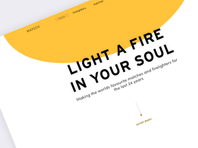
MATCCH - Web idea
Today's quick dribbble...
Matcch
(A fictitious match and firelighter company)
I was thinking that this company probably doesn't sell matches directly from it's website (who buys matches online...!). So they're probably looking to show off their products to investors and possible in-person customers (do people invest in match companies... ah, i'm sure they do).
Because the site is mainly for investors + advertising, UX can probably sit secondarily (I say this incredibly rarely...). Due to this, I think I'll just have some fun when I do the rest of this site, apologies WACG. Will post further musings on this in future.
Inspiration
We have a wood burner at home, let's just say I might have been in the room when I was coming up with this design.
Dev Aside...
From a dev side, making that big blob stay in the right place on multiple screen sizes is going to be a pain, but we're in design land here, so anything goes (tbh, I don't think it'll be that bad).
Improvements
The front page doesn't scream matches at me until you read the supporting copy (or notice the little match head at the bottom). I'd like to add something that really makes it clear from the get-go.
