Highline Beta
About
Highline Beta, our long-standing client, is a hybrid corporate venture studio and VC firm that works with ambitious Fortune 1000 companies to help them grow outside of their core with the help of other entrepreneurs. The company prides itself on rolling up their sleeves, working together as a team, and putting their clients on a path to success and future growth.
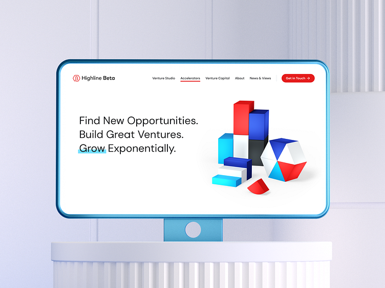
Highline Beta’s existing website had a very limited design system. Our job was to create a new website that was original in design and reflected the company's values and personality. We needed to easily convey the company’s value proposition, explain their ‘we are not posh, we are real’ approach to working with clients and establish credibility without being intimidating.
Visual Identity
Our team quickly realized that in order to create an impactful website, we first had to refresh and expand the company’s brand but, most importantly, develop a new, unique and powerful visual identity. Through bright, bold, and almost ‘daring’ colours we were able to show that Highline Beta are ambitious, risk-takers, and non-ambiguous. We then picked an easy-to-read font that showed the real, direct, yet personable approach to working with their clients.
Idea for Visuals
For the visual identity, we came up with the idea of ‘Building Blocks’, custom 3D illustrations, that demonstrate the company’s values — Partnership, Transparency, Ownership, Grit, and Adaptability. This concept truly brought the nature of their business to life — helping corporate clients innovate. We believe that innovation comes in different shapes and sizes, it’s about combining different concepts (that may or may not fit), trying different things, and experimenting in order to create something that hasn’t existed before. We also use infographics metaphors such as pie charts, and histograms, because they would speak directly to corporate clients, as well as communicate the idea of growth — the main reason why companies would partner with Highline Beta.
Final Key Visuals
Website
In parallel to establishing the new brand identity and key visuals, we built a new website to help improve the information architecture, make the navigation more intuitive, simplify the site content, and create clear calls-to-action that lead to conversion with real client testimonials sprinkled throughout the pages.
We are Oddbee
Digital Hive. A creative digital agency based in Toronto. We create brands, products and websites for ambitious tech companies and startups.
🔗 Check out our portfolio on the website: oddbee.com
✉️ Got a project? Drop us a line at hello@oddbee.com
Thanks!


