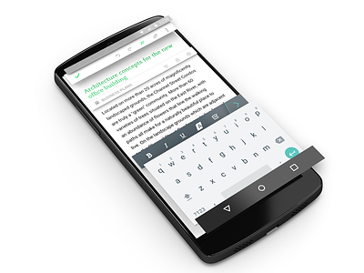
Evernote Android Material - Depth example
Another example for the Evernote update for Android. Shows the thinking behind using depth as a UI element for clearer hierarchy and usability, styled using the Google Material Design Guidelines.
More by Adam GF View profile
Like

