Spotify — Year In Review 2014


The Year in Review is an annual infographic generated for each Spotify listener, charting his or her music habits from across the year. In 2014, Spotify paired up with Razorfish to create a rich, editorialized experience for each user — tapping into their data to celebrate every listener's individuality.
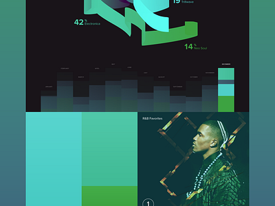
I was commissioned by Razorfish to explore the graphic possibilities for a signature mark - the centerpiece of every user's review. I selected a variety of datapoints (genre interest, appetite, frequency, and volume over time), and used it to inform the shape dynamics and coloring of a 3D mesh, which would be generated algorithmically for each user.
I designed a prototype 3D system to automatically read in the tabular user data, and then render large visual result tables at any resolution needed.
I assigned specific color palettes and core shapes to all of the top-level genres — for example: strong square geometry for electronica, feathery curls for folk, etc. Each expressive drawing would be completely unique from one another, yet the data ensured that users with similar behaviors would still be able to identify and compare with each other.
Attached is my YIR layout version and several output tables of visualizations.
Near the end, the internal release of a new Spotify brand bible ended up making this obsolete, as their new look+feel emphasizes simpler, more angular, and more pop-graphic forms.
