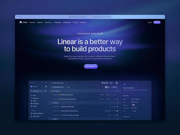
Linear hero…but with details
The recent Linear marketing site redesign made some big waves when they showed their design process in a live (though non-editable) Figma document while experiencing a DDOS attack to their infrastructure.
Despite their redesign being quite impressive, it was ultimately a big missed opportunity from my perspective. It seems that some of the best designers in the industry have a great sense for the big picture composition, but have far less appreciation for precision and the smaller details. The colors were dull and desaturated, the lighting effects didn't make sense, and the accents lacked contrast with the primary palette (except in detail pages)
In my speculative redesign of the hero, I focused on making the page come to light by giving the details the same care that the layout was given.
See the realpixels:
Be sure to see the before and after below.


