Software UI | UX and Branding
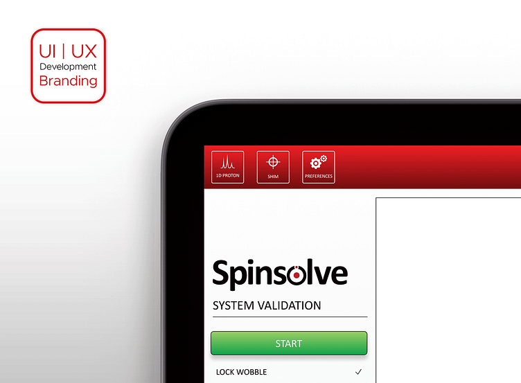
This project required designing the UI | UX for a Magnetic Resonance Imagining (MRI) system software from Magritek Ltd. Within this team of scientists and engineers, I was the sole designer and we were all jumping into uncharted waters.
The idea was to make the system work in the easiest way possible. The software is so robust that it has a steep learning curve to master it. It was important for our customers to be able to run experiments and get results within minutes of opening the box and connecting the system. Therefore, making this process as easy and quick as possible was imperative.
It was decided then that an interface would be explicitly designed for the plug-and-play experience. It would guide the user through a simple set of steps without worrying about setting up parameters for more complex experiments.
Because the experiments that are run through this system are unique, there are no standard icons or symbols that can be used to identify these processes. A new icon set had to be developed. This proved to be quite an exciting task since several concepts had to be graphically represented.
Acquiring specific data sometimes involves shifting certain parameters to get a better resolution of the graph. Here is a sample of the icons used and created for the software.


