Regestra platform
Overview
Regestra is a professional/social network platform that aims to connect artists, art collectors and gallery owners, so that they can expand their professional network. The platform’s future prospect is also to provide transparently in terms of art’s authenticity, through history records for each piece of art integrated into blockchain.
Problems that the platform tries to solve
The art market is fragmented and still not widely digitalised.
There isn’t yet an “industry standard” tool for the traditional fine artists networking.
It is very difficult for the collector to be absolutely sure if a piece of art is authentic.
My role
In this project I was in charge of all the design aspects. Everything presented here was executed entirely by me. (UX Research, UX Design, Logo Design, Branding, Design System Creation, UI Design, HTML/CSS implementation)
Branding
The colors were chosen within the spectrum of turquoise and purple. Turquoise is usually associated with attributes like creativity and transparency, while purple is usually perceived as luxurious and artistic. These attributes align really well with the scope of the project, without being too informal/fun/funky, but keeping also the professional character of the project.
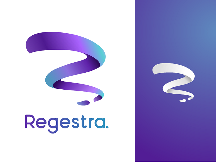
As for the logo, since the project refers to art related people, I chose to create something with intense curves rather than straight lines and angles, to give a more abstract/artistic sense, as opposed to a more “technical”, “squared” one. These curves may also resemble an artist’s brush stroke. Also the goal was to give an abstract R shape, Regestra’s initial. The logo works well both in full-colour and monochrome and in all sizes.
UX Design decisions
Initially I gathered some data from professional artists and art lovers through a set of questionnaires about the problems they face in networking and promoting/discovering artwork.
The most important feature for the users seemed to be the professional aspect of the platform. A secondary social/informal aspect seemed also to be desirable. Briefing about local art events and direct user messaging were also within the desired features.
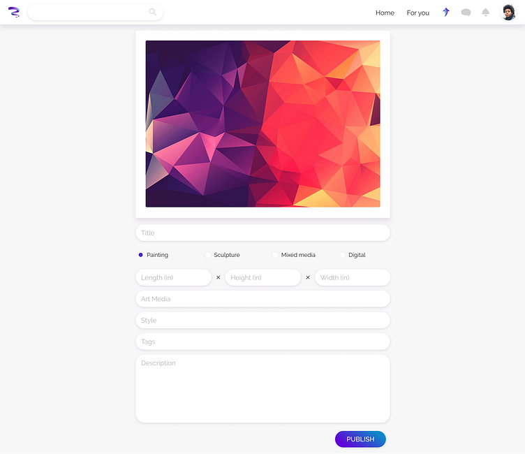
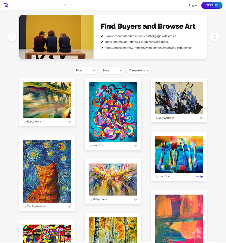
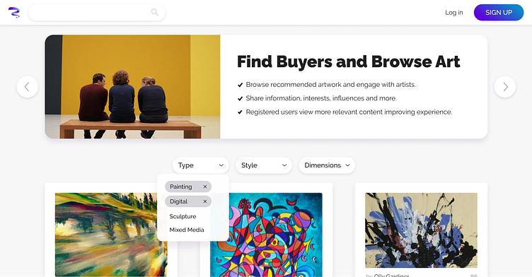
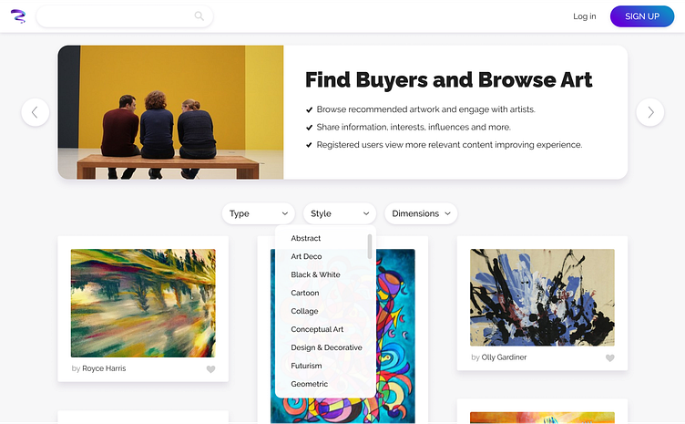
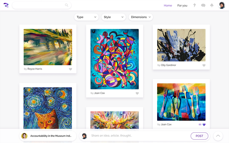
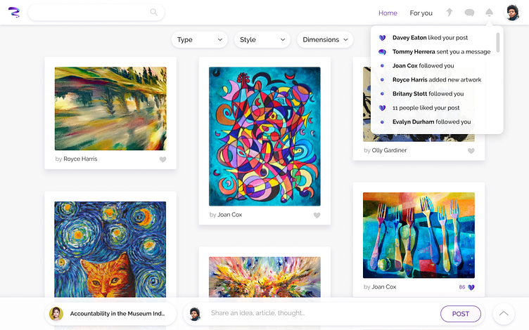
Based on these findings, I decided to create a page for art browsing as straightforward and flexible (I included some quick browsing filters) as possible, as the default/primary view of the platform.
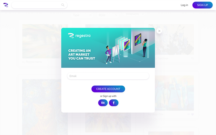
The artwork is visible to non logged-in visitors with limited functionality (no filtering, no likes) in order to engage them and stimulate their interest for the full experience. A banner at the top of the non logged-in version of the homepage, is used to introduce the new visitor to the main features of the platform.
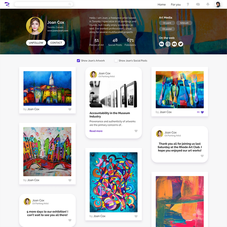
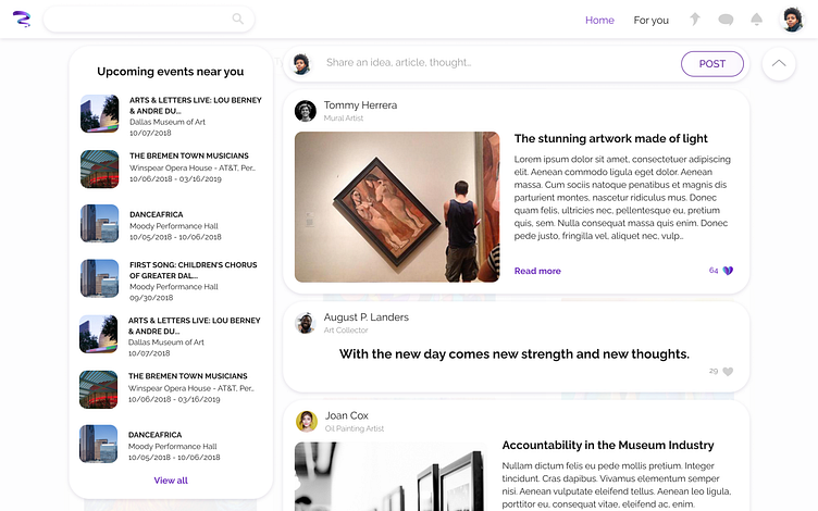
After logging in, the homepage offers its full functionality which includes its social aspect.
By default the social panel is minimised (as secondary functionality) in the form of a fixed bottom bar. In its minimised state, a minimised feed of social posts is visible to notify the user about the social activity that is taking place. Its expanded version is a full screen bottom drawer where users can share social posts and learn about local art events.
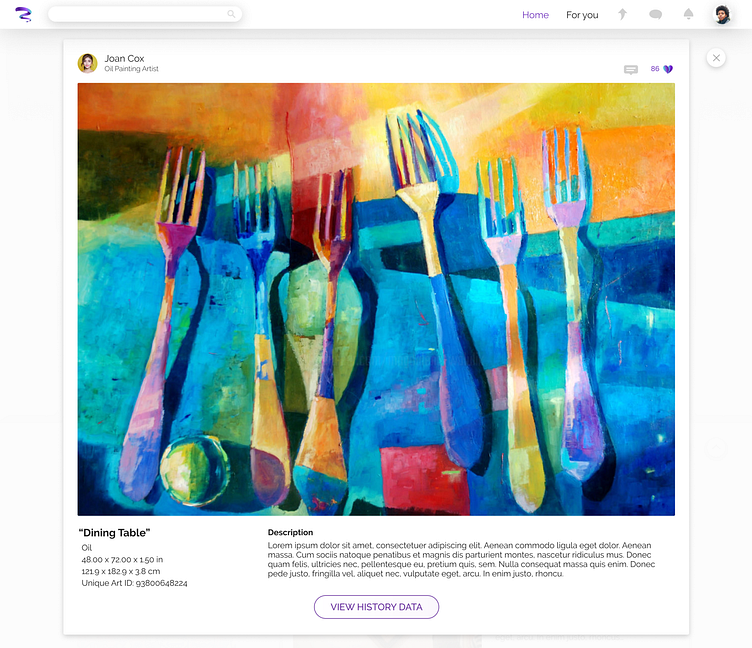
In the expanded view of a specific piece of art, apart form all its physical attributes, its unique ID and full provenance history will be available.
UI Design decisions
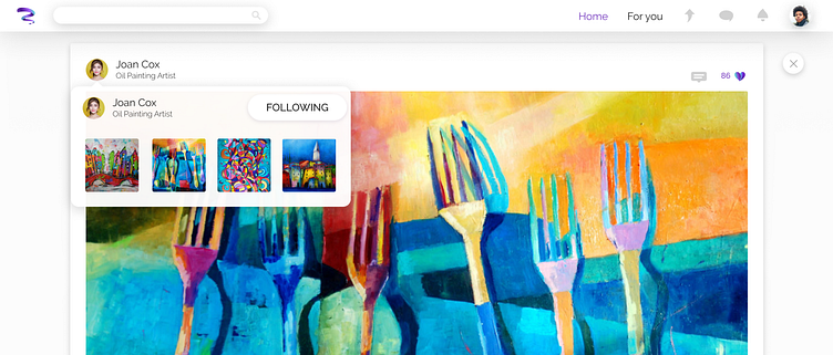
Since the platform is all about users’ artwork, I wanted my GUI to be as much “art neutral” as possible. I wanted it to serve as a blank canvas for the user. So, I decided to create a minimal, nearly white, with subtly shadows, environment that gives as much space as possible to users’ creations. I also used some subtle transparencies on dropdown menus and modal overlays, in order to give an elegant “thin paper” feel.
The homage’s GUI aims to resemble a physical gallery wall with hanging frames. I kept some wide spaces among the pieces of art in order to give each one of them, the value and quality that a physical piece of art would require.
As for the typeface, I avoided Serif fonts, because I wanted a more modern look (aligned with the technological aspect of the project) and with better readability. But since art is a rather classic subject, I didn’t want a super modern typeface. So I chose Raleway as the main font family, because it embodies some classic elements, while being Sans Serif with a very good readability and multiple weights.
Finally, I created the iconography to be in align with the logo design, in terms of curves, and colouring style.