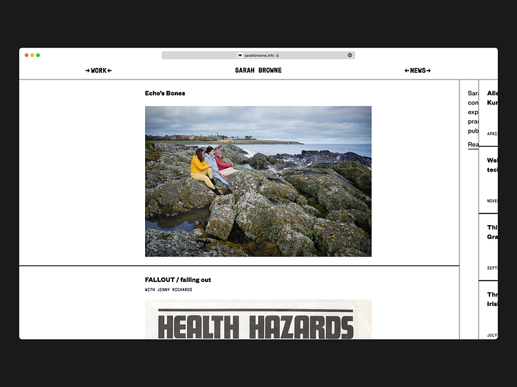
Sarah Browne • website & wordmark
Using a three-column grid to focus on single portfolio elements, or all at once.
Website and wordmark for @sarahjaybrowne 📑✨
Letting the website visitor focus on either Sarah's work or news, or both, reflects the importance of each to her practice. The modular three-column grid forms the basis for the rest of the website.
Set in GT Pressura by @grillitype and Founders Grotesk by @klim_type_foundry.
More by Take Courage View profile
Like


