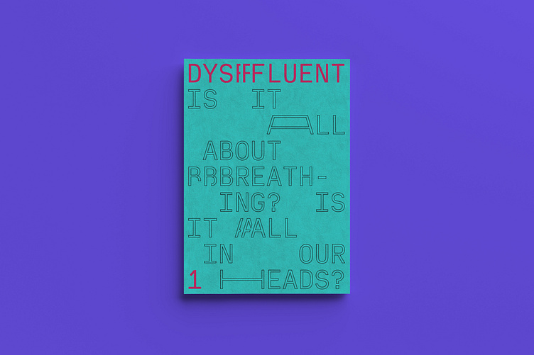
Dysfluent • Editorial and type design
Dysfluent gives stammering a visual identity to reflect a sense of pride about the embodied experience.
A custom typeface, Dysfluent Mono, emulates the voice of the stammered voice. Interviews conducted with people who stammer were set in the typeface and feature in a printed magazine. It was launched in 2020 and has been recognised by @100archive, @d_and_ad, and @itsnicethat, as well as being stocked in @magculture, @stackmagazines and @tlp_says. The project has received funding from Arts Council England for a second iteration coming in 2022.
Typography
Set in Spectral by @productiontype and custom typeface Dysfluent Mono.
Supported by
Arts Council England, Irish Stammering Association & STAMMA.
Featured in
100 Archive, D&AD, Der Kiesellstin, It's Nice That, JIVS, magCulture, Monocle, Positive News, RTÉ News, Stack and The Library Project.
More by Take Courage View profile
Like


