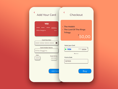
Card Checkout (Daily UI 02)
This was a tricky one!
When looking for inspiration, i noticed one interesting thing: Two or more screens. And that made total sense to me, when you make a checkout screen you also make the add card screen, for example. And this kind of questions are totally valid, so i decided to make two screens today, and the result is here for you to see.
Again i used warm colors, and honestly i'm starting to find it hard using them, so maybe tomorrow i will change my style for once. For the fonts, i used “Montserrat” and “Karla”.
Please leave some feedback so i can get better :)
Thanks!
More by João Vitor Custódio View profile
Like
