Jacksonville Jaguars Concept
Taking a crack at the Jacksonville Jaguars
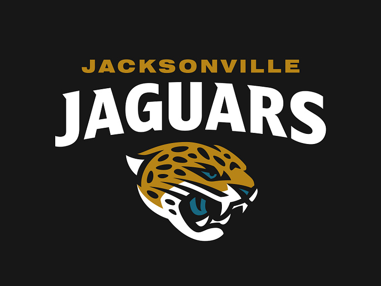
While the current logo is a better anatomical representation of a jaguar than the previous, it lacks the traditional sports aesthetic that has been proven to be effective. This concept captures the essence of the beast while wrapped in a way that balances detail and durability.
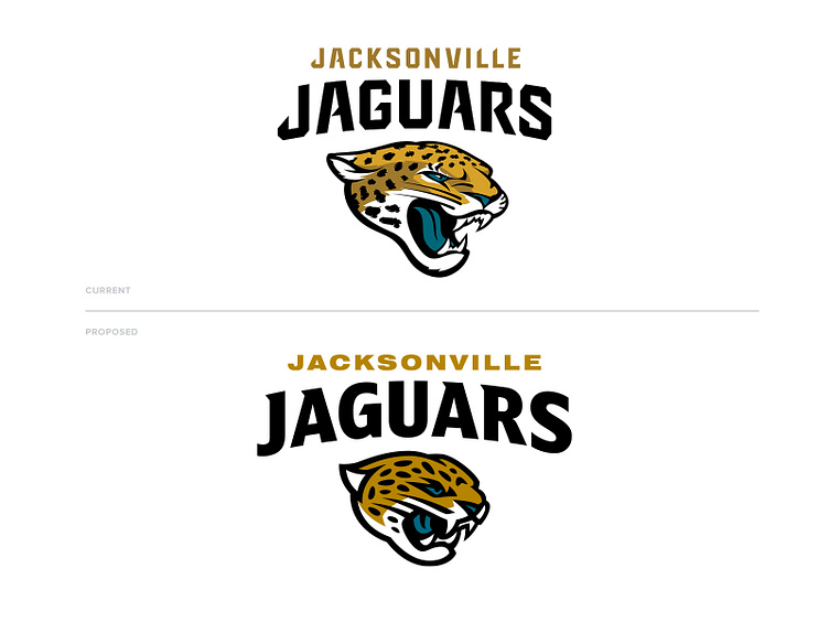
With the new jaguar is an entirely rebuilt wordmark as well. To better understand the creation of the current typeface, I read through an interview with the NIKE Creative Director of Football from May 2013. A certain perception stuck out to me, specifically the idea behind the typeface that likens its jagged and angular approach to be “characteristic of the jaguar”. It’s my humble belief that sharp angles and jagged edges are quite the opposite of the jaguar. These creatures are fluid and stealthy, and I worked to implement this into the wordmark.
This is only a concept and is no way affiliated with Nike, the Jacksonville Jaguars, or the NFL.