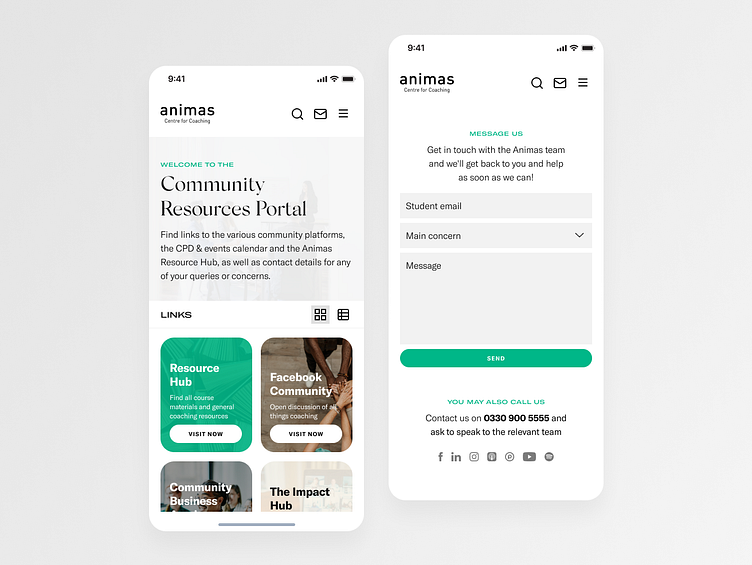
Animas Community Platform | Product Design
Animas Centre for Coaching is a school that develops highly-skilled coaches grounded in humanistic practice. Learn with a diverse international community of coaches that enables social connection and lifelong engagement with coaching. Get the support throughout your professional lives.
________________
Overview
Background
I worked with Animas Centre for Coaching on refreshing their brand identity and designing their Community Platform. I collaborated with the CEO, Marketing team, Analytics team, and developers.
Company
Animas is one of the top coaching schools in London that trains, develops, and supports coaches to make an impact in the world through coaching.
My Role
I served the role of UI/UX Designer and Visual Designer. Aside from developing Animas's brand refresh, I also had product responsibilities — I helped with the previous interviews analysis, created personas, and defined features.
Timeline
2 week sprint
________________
Problem
Based on customer surveys, user interviews, and market research, client noticed that their users:
1. Regularly struggle with searching the resources given to them during class and webinars
2. Have difficulty keeping track of multiple links being given to them during discussions
3. Regard their current visual language as outdated compared to other coaching schools
Solution
To provide the students all the resources they are searching for in one place, we recognized the need for an internal community platform that houses and connects them to all the important links. We also did a brand identity refresh to elevate the brand's visual language and image.
Goals & Outcomes
Success will be measured through usage metrics, increased overall user engagement and user satisfaction, and decrease in users who submit complaint tickets.
Process
1. Empathize & Define
2. Ideate
3. Visual Design
4. Prototype
5. Testing & Iteration
Empathize & Define
Research methods: Stakeholder Interview; Review of the company, past user research, analytics, and current functionality
Analysis tools: Affinity Mapping, Primary & Secondary Personas
The project goal were to "design a resource hub that allows current students to navigate all the school's important links in one place to provide better satisfaction while learning," and to "refresh the company's look and feel to position Animas as the industry leader they are."
Take a look at their original website:
At the beginning and throughout the design process, I examined Animas's website to learn about the company and their existing features to provide students their lecture resources.
After reviewing the company's previous user interviews by analyzing their research findings and interview notes, I have learnt that they only have customer service representatives that answers concerns from new and current students. Moreover, students only receive the links for resources and community social media either through follow-up emails, newsletters or when being given to them during lectures.
I created a primary and a secondary persona as a way for the team to focus together on the priority audience's needs and help us keep them in mind throughout our design decisions.
Ideate
Analysis: Comparative analysis of 3 school portals
UX tools: User Flow, Site Map, Mid-fidelity Wireframes
According to the company's analytics, 68% of their students use their mobile to review their notes and check the community's social media groups. We decided to create user flows, a site map, and mid-fidelity wireframes primarily for mobile.
We then proceeded to create a responsive one for the desktop version.
Visual Design & Prototyping
Design method: Art Direction, Brand Identity System
Design tools: Adobe Illustrator, Adobe InDesign
Due to the timeframe given for this project, we made the decision to design the high-fidelity wireframes for both mobile and desktop versions before proceeding to usability testing.
But before that, I refreshed Animas's brand identity and visual language. I started with coming up with a visual language strategy then proceeded to reinforce the concept after the buy-in from the CEO and stakeholders.
After presenting the brand identity refresh to the CEO and stakeholders, they approved it and then I applied it to high-fidelity designs.
Testing & Iteration
UX method: Usability Test, Affinity Mapping, Prototype Iteration
We then proceeded to unmoderated usability tests of the designs. There were 5 participants who tested it: 3 experienced coaching students and 2 new coaching students.
In general, the desktop version was pretty straightforward so the participants got the whole purpose of the layout right away. It was a different story for the mobile version. Here are some insights from the usability tests:
One of the problems participants experienced that I observed was it began for the burger icon (menu) to be annoying when they have to keep clicking it to navigate the dashboard.
There was also a trend of what the participants thought of the overall layout of the dashboard and Contact Us section:
Dashboard layout
Scrolling to see all available links was way too long. Most participants mentioned that they prefer if they can see all options and click on it right away.
Contact Us section
After scrolling over the numerous links, participants got overwhelmed by yet another long list of contact information.
________________
Prototype Iteration
We changed a flow and the site map for the mobile version. I then applied the changes based on the insights we gathered from the usability tests.
I started with some low-fidelity sketches, then applied the changes to hi-fidelity prototype.
Outcome & Reflection
We recommended some features to consider for future development based on relatively smaller amounts of user feedback. If more users request these capabilities, Animas can add them to the roadmap.
1. Quick Onboarding Flow
Explanatory onboarding flow that describes how to use this new internal community platform and its features.
2. Live Chat Feature
A feature that allows students to communicate with customer support representatives in real-time.
________________
This project definitely helped me to become a better communicator and presenter to our stakeholders. It helped me improve explaining my design decisions and giving feedback at the same time.


