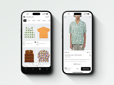
Styles Available Now
Had a lot of fun coming up with this browse experience for our iOS app. It was a delicate balance of visualizing brand name, retail price, rental price, and size availability. Filters were probably the most important as we often had pieces completely rented out. With over 2000 SKUS, we also had categories, filters, and sorts. At one point, I played around with an option to minimize and maximize the product grid. Maybe I'll share that later.
The product page itself was also really tricky. It felt less like a traditional e-commerce product page and more of an Airbnb listing. When we introduced the concept of "rent to own" we also had to factor in payment timelines, purchase price, and a rental calculator.
Fun fact, all product photos were taken in-house by us in a 500sq ft photography studio. 2 years into the company, I was still helping edit photos during nights and weekends just to keep up with weekly releases.
