Dashboard | Before & After
Hi everyone, 👋
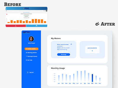
Here's the redesign of a dashboard for an electricity recharge web product.
The old page is very user unfriendly, visually busy and difficult to use. I've cleaned up the UI and arrange it in a more usable way.
I've also added a CTA to quickly recharge and to log out.
Looks much better!
Feel free to leave your feedback! Thanks👍
More by Sofia Dias View profile
Like

