Anfix - Saas Case Study
The client
Anfix is the most powerful accounting software in Spain. It facilitates the management of companies by automating all accounting tasks.
Anfix allows the digitization of all invoices and receipts through a single photo. All this information is securely uploaded to the cloud, enabling real-time collaboration with bank advisors.
The challenge
As with most software companies, Anfix is very technical and solves many highly complex problems. So the old site was as technical as the product 😅. And this creates a massive gap between the product and the customers.
The solution
Together with the marketing team, we researched, strategized, and designed the new Anfix visual identity, supported by a human-centered website design and a scalable design system.
Visual identity
After extensive competitor research, I focused on establishing a more emotional connection with Anfix’s customers through content and design.
I modernized their logo, introducing a new design language through color, typography, and style.
I also created new brand guidelines to help maintain structure and visual impact across print and digital applications.
I've defined a unique and bold color palette combining light and darker tones to provide depth and maturity to the brand.
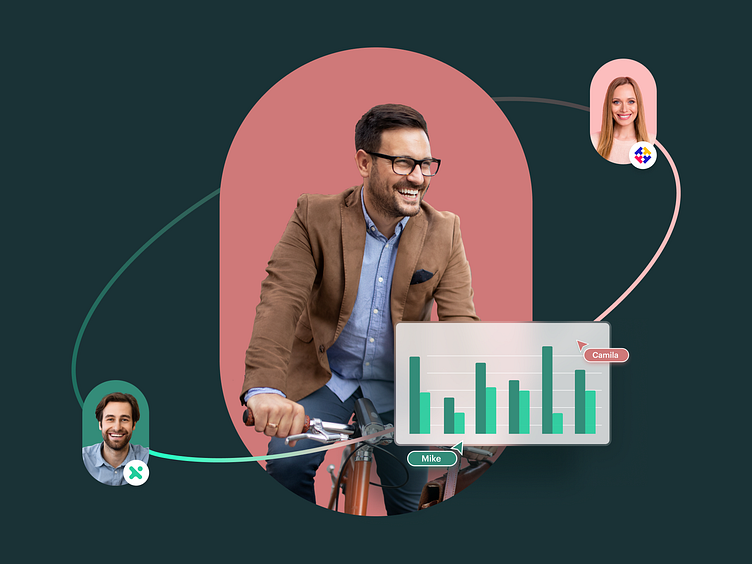
For the background with people, I used various forms inspired by the logo's elements to express diversity and to make a stronger connection between software and humans.
The website design
Together with the Anfix marketing team, we analyzed the users' behavior, which included charting typical user flows, reviewing heatmaps of the most engaging areas of the site, and examining the process stages where most users often failed.
The newfound data helped me suggest a revised navigation structure and general improvements on primary touchpoints like the homepage, business types, solutions, and pricing page.
A crucial direction was to create a clear differentiation between the main Anfix solutions. The analyzed data showed two completely different categories of users with different ages, interests, and needs. So we created a separate page for each type.
The design was tested before implementation to ensure the best possible result.
Feature pages
I decided to use the same representative shapes for the feature pages.
Everything was created modularly to keep the design simple and efficient and to increase the development speed.
Pricing page
The pricing page is one of the most important pages. So after many design variants and several tests, we reached this result.
It is a very simple and clear page, without anything extra to distract attention.
Sign Up Process
Because the registration process is quite complex, I opted for a separate page without distracting elements. And I have divided the whole process into several steps not to create confusion.
Services provided
Research and analysis
UX design
User flow
Design System
Marketing assets
Website design
Let's connect!
Hey, I'm Cristian, a multi-disciplinary freelance designer.
I approach every project with a clear vision and go through all the design stages, from wireframe to a 100% polished design, ensuring the result will be efficient.
I'm available for freelance work!
Feel free to contact me: cristian99sx@gmail.com


