the Labelmaker: Zlaten Rozhen Metal Wine Label Design
https://www.thelabelmaker.eu/portfolio/metal-wine-labels/
A Premium Wine to Celebrate a Private Classic Cars Collection
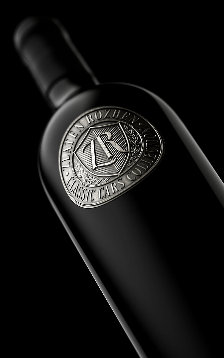
Zlaten Rozhen is a winery located in one of the most interesting wine regions of Bulgaria – the Struma Valley. In addition to the great wines they are famous for, the owners decided to combine wine with another passion of theirs – collecting vintage cars. This is how the idea for Zlaten Rozhen Classic Cars Collection was born – a museum with an area of 660 square meters, housing the entire collection of vintage cars of Teodor and Marusia Osikovsky. At the same time, they came up with the idea of celebrating this new family venture with a very special wine and I was commissioned to do the design work. This time we all decided that we didn’t want a classic paper label – we wanted to look for a different solution that would make the design itself much more individual and special. So we came up with the idea of using a metal wine label, which wasnt something new to me as I had already done some designs of flexible metal labels and even received a Pentaward for one of them. It was different this time as I was absolutely convinced that we should do a cast metal wine label, which is very specific in terms of both design and production. I’ll start with the design work. I decided to make a classic oval label. My original idea for it was to reach 2-3 millimeters thickness. I really wanted it to have different levels of embossing on it to help me highlight the more important elements. I spent a lot of time wondering exactly what color it should be – I started with copper, then silver and finally, of course, gold. It turned out that we all like a more austere, clean and even conservative look, so we settled on silver. Here I ran into the other problem. I didn’t want a plain silver finish – I wanted a scratch patina, I was looking for an authentic look and bold character. In the end, we decided that the answer to all these questions is one and it is called Apholos. This is, for me, the most serious manufacturer in the world of such metal products, which I would like to call wine metal labels. Our colleagues from Apholos very quickly understood exactly what we wanted, and after a short discussion and fine-tuning of small details, our metal label was ready for production. The label would have everything I wanted – a soft semi-matt silver, lots of detailed scratches and minor surface dents, and a very contrasting, almost black patina that made the label even more classy and serious than I imagined. Before starting with the design, we chose a great bottle from Saverglass – Aleka. A very solid, heavy and bold bottle that would have worn our new metal label with dignity. The closure is with Portuguese cork, and on it we applied black matte wax by hand. The result for me was stunning on every level – from the bottle, to the wax, to the label itself. We achieved a design that respects with its presence and at the same time provokes with the play of different materials. The metal label itself has so much detail and relief that it challenges anyone to grab the bottle and touch it. Solid, masculine, classy, this new design gave a unique visual answer to the wishes of the Osikovsky family to unite under one roof their two greatest passions – wine and cars.
