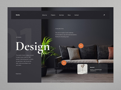
Interior design landing page
I loved the challenge of creating an elegant high class interior design landing page using subtle background textures and a playful layout.
Even though the original shot was great, it had some flaws that often get overlooked by designers that don't have to build the sites themselves. That is unnecessary complexity and responsiveness. As a product designer I think you should always ask yourself: 'How would I build this?' and 'How would these elements respond?' If you can answer those questions you can save a lot of hours and even revisions in the actual development process.
The best example is the main title which in the original shot broke out of it's container. It was a fun effect but it posed multiple problems:
Contrast with the background image can easily become an issue, so you get limited in the kind of images you can use as a background.
The only way to break out of the sidebar with the title is to not nest the text in the sidebar at all but overlay it. This would mean you can no longer scale the sidebar to the contents. This would be a disaster to get responsive.
You won't see this effect on mobile because of limited screen space so you get different styles on different viewports.
Knowing the impact for such an element lets you better consider if it's worth it to include it at all. Seeing as the designs look just as pretty, if not more elegant when sticking to the proper containers it was easy to see simplifying was the better call here.
What do you think about this thought process? and what do you think of this design? Press❤ "L" if you like it.
Tools: Adobe XD & Adobe Photoshop
Check out the live website and say hi 👋 at 🌏 www.sera.nl