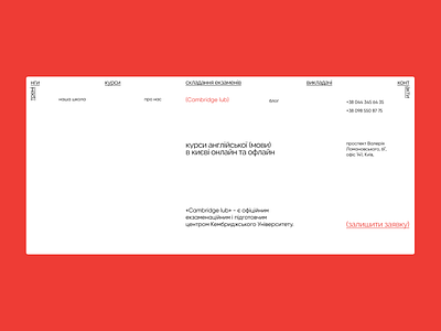
The website for the english courses
Using underlined and bigger text in the header, I wanted to show the importance of these words and not interrupt the visitors with the same font size in the header. Also I decided to use minimalistic design with the white background and simple font to focus the visitor's attention to the information.
More by Oleksii Muzyka View profile
Like
