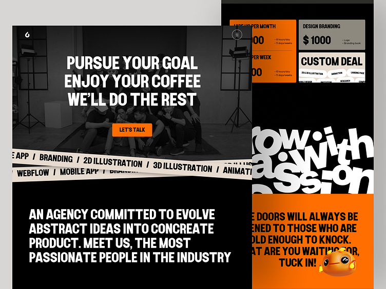
Odama Landing Page Redesign
Hi Folks!
Some more on the work we did for Odama Rebranding.
Here's the new feel for our Landing page. Bold is the main thing that we want to present to the client. Working with passion we're making it live now
Check out the full case study down below!
Design System
Thanks for checking it out!
Interested in partnering with us?
Say hello at hellodama@odama.io
or visit our website odama.io
Check us more at:
📷 Instagram | 🛒 Gumroad | 🎉 Figma Community | 🛍 Creative Market
More by Odama View profile
Services by Happy Tri Milliarta
Like


