UX/UI for Gaming

Project Overview
This work is a case study on Mojang's Minecraft Dungeons. It is the complete culmination of my coursework for Ivy Sang's UX/UI for Gaming live online course, hosted by ELVTR.
My Roles and Responsibilities
Learn and apply UX/UI best practices in a gaming context
Understand and demonstrate the player journey
Create both low and high fidelity wireframes, a UI style guide, and UI mockups
Plan and conduct a usability test with analysis
Seek and gather feedback and iterate on designs
Tools
Figma and Figjam
Adobe Photoshop
Zoom
Project Length
All the work completed in this project was done within 8 weeks.
Challenges
No prior experience using Adobe Photoshop
Little experience using Figma and Figjam
Limited access to art resources and artifacts
Understanding the in-game experience
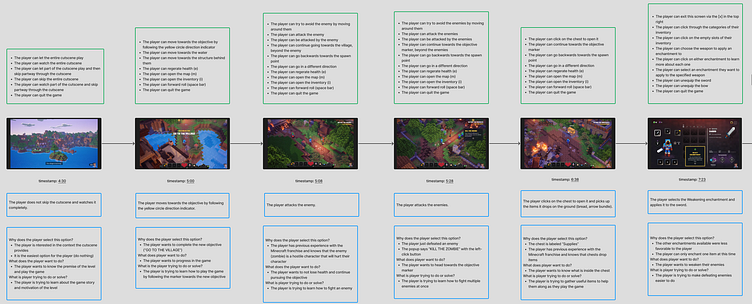
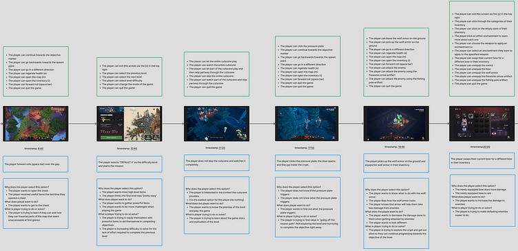
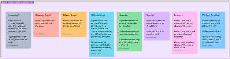
My first task was to watch a playthrough video and describe the in-game experience of someone playing Minecraft Dungeons for the first time in order to establish understanding of the game rules and different options available for the player. This audit helped me answer the following questions:
What options does the player have for each decision? (top text box)
What decisions does the player make in the game? (middle text box)
Why do you think the player makes each decision? (bottom text box)
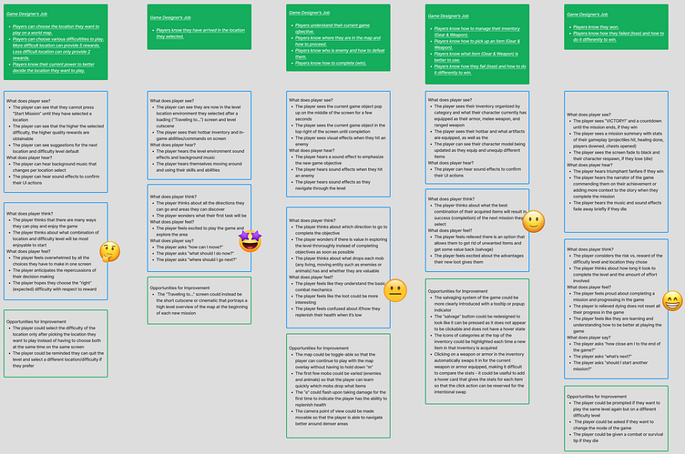
Documenting the player journey
Next, I was tasked with completing the player journey map - the entire experience a player has while interacting with a game. This includes what the player wants to do, what they see and hear, what they think and feel, and a first look at different opportunities to improve the current experience and help the player achieve their goals.
Paper Prototyping + Flowcharting
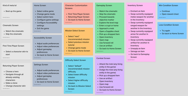
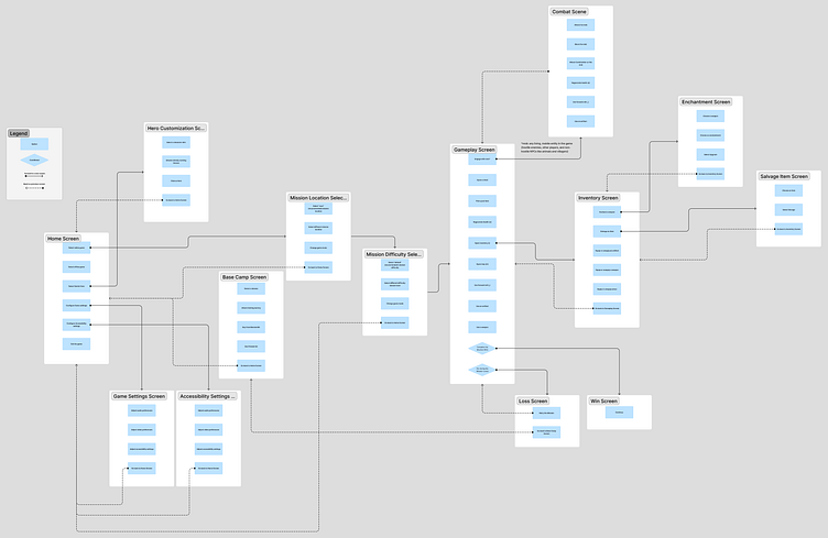
After a thorough deep dive into the game rules and the current in-game experience, I was able to start thinking about how to update and improve Minecraft Dungeons by creating a paper prototype. I organized all the game options (players' behaviors) into various categories (screens/scenes) and ordered them a way that I thought would be ideal for the player to pay attention to, perceive, and remember. Then, I transformed all the same information into the corresponding flowchart to help better visualize the experience I designed.
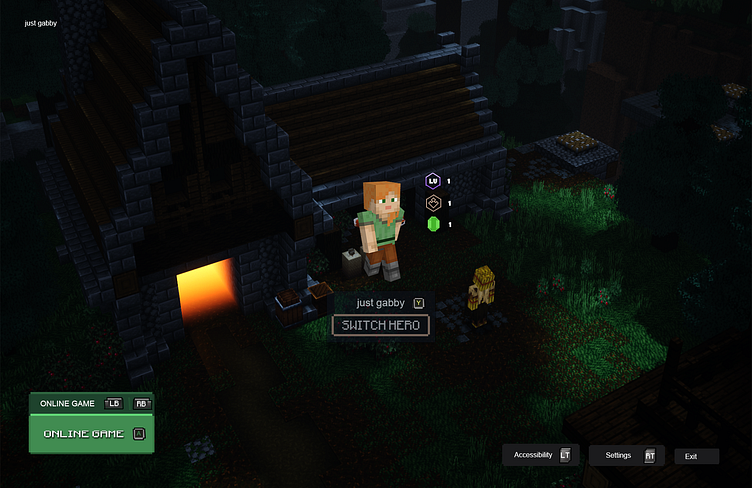
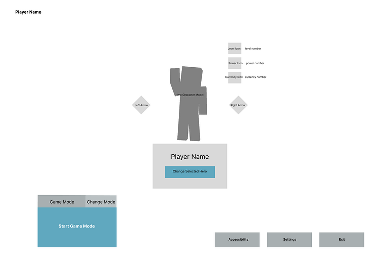
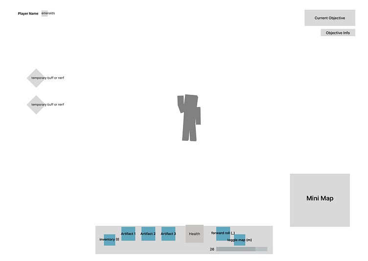
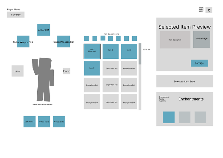
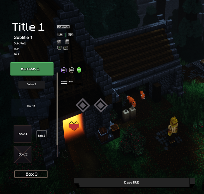
UI Wireframe v.1
Next, I worked on some low fidelity wireframes for the home screen, gameplay screen, and inventory screen.
Usability Testing + Feedback
After creating the first wireframes, I was then tasked to plan and conduct a usability test to gather feedback and ensure that my designs were easy to read, use, and understand. I defined my research objectives, 3 tasks for the participants, created script questions to ask each participant, conducted the tests, and finalized everything with a report and iterations on my wireframes.
Research Objectives
Evaluate wireframes (design communication) with players to understand potential miscommunications/confusion
Can players understand all the options on the home screen without assistance? If not, why?
Can players understand all the options on the gameplay screen without assistance? If not, why?
Can players quickly start playing the game from the home screen?
Can players identify what their current objective is?
How do players feel about the design on all screens?
Iterate designs based on usability test feedback.
Research Logistics
Recruitment: 20-65 years old, any gender, plays video games on PC. 3 testers.
Platform: Zoom (test sessions) and Figma (static wireframes)
Task Design: Go through 3 wireframes (home screen, gameplay screen, and inventory screen). Talk out loud all the options they have and what each options means to testers before they actually play.
Schedule: July 18, July 20, July 22
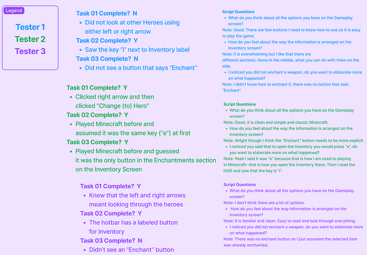
Tasks
01: Select a different Hero on the home screen
02: Open the inventory screen from the gameplay screen
03: Enchant an item on the inventory screen
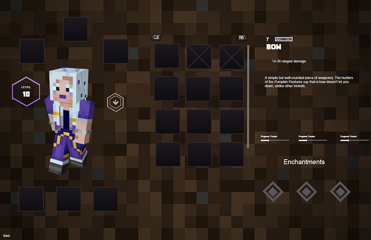
Usability Test Results + UI Wireframe v.2
Report
All participants were able to open the inventory screen but Tester 2 used their previous knowledge about Minecraft to assume things about this game and thought the key was "e" at first. Tester 1 and Tester 2 both did not know how to enchant their weapon because the button to enchant was not clearly marked. Not all participants knew what the left and right arrows were supposed to do on the home screen page.
Action Items
Speak with the UI artist about the "Enchant" button and try to iterate together to make it more clear
Speak with the UI artist about the inventory key and try to iterate together to make it more clear
Speak with the UI artist about the left and right pagination arrows on the gameplay screen and try to iterate together to make it more clear
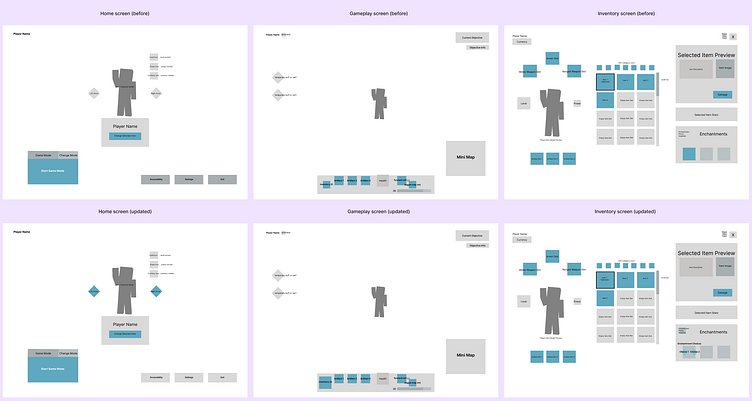
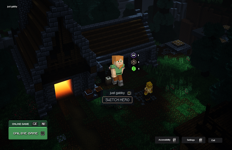
UI Mockups
Finally, it was time to turn the wireframes into some full-fledged UI mockups! The following are the assets and references I used to create the UI style guide and home and inventory screens.
Assets and References
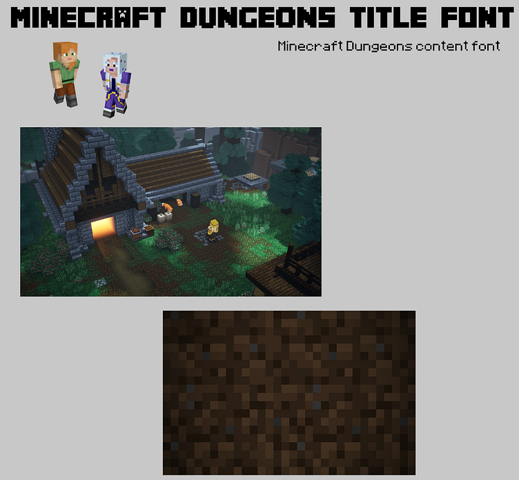
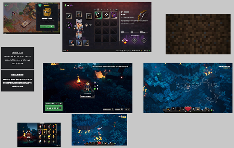
UI Style Guide + Home and Inventory Screens
Outcomes
Alterations were made to the wireframes to more clearly identify buttons and their functions thanks to feedback from the usability test sessions and actively seeking feedback from peers via Discord and Zoom
Learned how to design and implement those designs within a short time period and with limited resources and experience using Adobe Photoshop
Gained a deeper understanding of best UX and UI practices in a gaming context and am looking forward to growing my skills even more!
Conclusion
Thanks for viewing! Check out my website to see more of my work or to get in touch.
Take care :-)