Improving the Reading Plan Experience for YouVersion
A product design exercise by Keenan Sultanik to refine and redesign the user flow and interface design for YouVersion’s reading plan feature.
This project was completed on my own and not affiliated with Life.Church or YouVersion.
🕑 Project Duration: 1 weekend
🖥 Apps Used: Figma, Notion, Whimsical, Photoshop, and InDesign
Understanding the Design Problem
The reading plans feature of the app presents an interface for users to keep up with their daily reading and allows progress to be marked off in an orderly fashion. Key aspects of the feature include:
1. Marking completion progress clearly
2. Allowing users to easily jump into the next reading portion with context
Current User Flow
The feature starts users at the current day in the reading plan and presents today’s reading portions in the form of a checklist, allowing users to jump into today’s assignments. It also displayed how many days behind a user may be, but does not indicate the user’s overall progress through the plan or easily allow the user to jump to the next sequential assignment.
Problems Identified
The default view ignores missed days/passages instead presenting the user with today’s passages
Missed days must be manually found and selected
No context is provided for the next passage when moving from one passage to another
Completing the day’s plan presents a disruptive full screen slide that offers very little in the way of next actions or information on the user’s progress
The “catch me up” feature may appear to complete missed passages but instead adjusts due dates for the plan.
Defining the Challenge
Designing a reading plan flow that provides greater progress information to users and allows them to jump into their next passages more easily
The Prompt
Redesign the flow and UI for completing plan days and finishing a plan.
How should users interact with it?
How should it feel?
What would the UX flow be?
Are there features we should have that we don’t?
Are there features we should remove and why?
Research Method 1: Competitive Analysis
I reviewed several Bible apps that included a reading plan feature, including Olive Tree and Logos to better understand user expectations when they approach the feature in YouVersion and to provide some context for my approaches to the redesign.
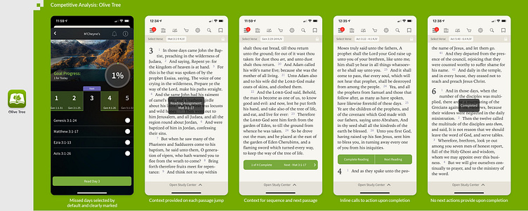
Olive Tree
Olive Tree does an excellent job of providing context on where the user is in the reading plan and in keeping the plan navigation and controls inline with the reader interface. However, there are very limited “next actions” presented to the user upon completion of a day’s plan, which seems to be a missed opportunity to maintain a high level of engagement with the user. Also, the dashboard for the reading plan is not consistent with the rest of the UI, which add a disruptive element to the experience.
Positive
Provides progress for the overall plan several ways
Selects the earliest missed day by default as “next”
Reminds the user where they are currently reading whenever a jump is performed
Provides controls inline with the reader
Negative
Limited “next actions” are shown to the user upon completion of the day’s plan.
User’s place in the reader prior to starting the day’s plan is lost.
UI of the reading plan dashboard is not consistent with the rest of the app.
While the user can return to the dashboard at any time, doing so is not intuitive.
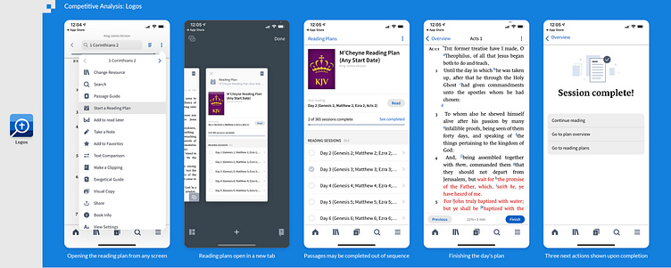
Logos App
Logos on the desktop is a robust Bible study suite, however on mobile, it seems to instead seek to offer a simpler daily reading experience. The reading plan feature opens as a new window (or tab) to keep the user’s place in the regular reader. The dashboard provides overall progress through the plan and allows the user to look ahead without having to select anything to do so. The user may interrupt the plan and return to the previous tab to look up a different passage without losing place in the reading plan. When the day’s plan is complete, the user is presented with three options for maintaining engagement with the app, including continuing to the next reading set, returning to the dashboard, or opening another reading plan. The experience is consistent and seems to provide the user with the right controls at the right times.
Positive
Plan opens as a new window to keep the user’s place and allows switching back without interrupting the plan.
Dashboard clearly shows overall progress and the next several reading sets.
Users may return to the dashboard at any time during the plan.
Plan completion page presents several possible next actions for the user.
Negative
The next passage is not displayed in the reader when there are multiple assigned to a single day.
Future plans’ passages are truncated if longer than the width of the screen.
Research Method 2: User Interviews
Casual 1:1 interviews were performed with two users of mobile Bible reading apps who had limited experience with YouVersion prior to this research. Each subject was given the task of completing the current day’s reading plan, which was followed up by a brief interview. The narrative was intentionally structured around the following questions:
How easy was the reading plan to complete?
Were they aware if they were ahead or behind in the reading plan?
Did they feel stuck or frustrated at any point?
User Interview Insights
Figuring out the settings was described as being confusing. This area will likely need to be redesigned for increased clarity.
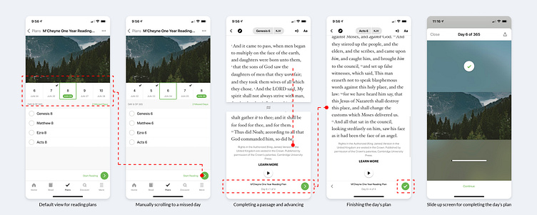
One subject thought that the “next reading” button in the reader merely advanced to the next chapter, not the next passage in the plan and was returning to the plan’s dashboard after each passage to check it off manually. Clarity will be needed for the redesign of the in-reader progress bar.
One subject described the process of scrolling back to where she left off when she was behind in the plan as annoying.
One subject who already had an active plan commented that seeing how many days behind she was in the reading was discouraging to her returning to the app. We might consider a more causal mode for completion dates.
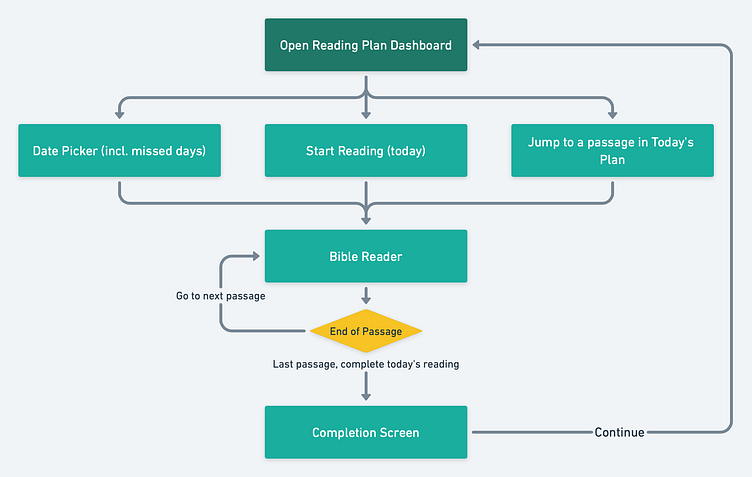
Designing a Solution
Framing the Solution with Stated Goals
Provide the user with more actionable options upon completion of a reading plan assignment
Display more contextual information of the user’s progress
Increase user engagement within the reading plan and encourage goal completion
Approach 1
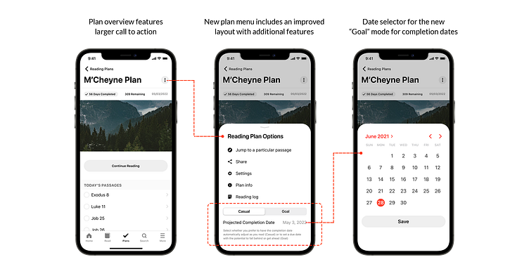
For my first approach, I focused on refining the existing user flow and subtly adding in some of the best UX features of the competition. This resulted in a similar user flow to the original, with the addition of more options upon completing the day’s assigned reading. One new improvement was to rename the “Catch me up” feature to “Adjust plan dates,” which more accurately describes to the user what is happening. This would take place on a slide up panel to accommodate more UI features and allow the user to understand what is happening before the plan is modified.
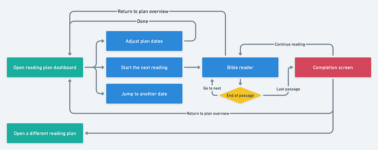
“Open a different reading plan” feature added in case the user is actively engaging in more than one plan (an annual through-the-Bible plan and a 30-day premarital plan for example). (Aligns with goal 1)
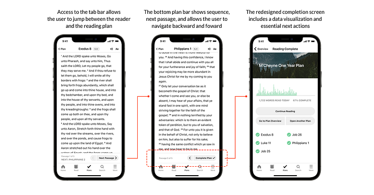
“Continue reading” option upon completion encourages the user to continue engaging with the reading plan and promotes further progress towards the goal, especially if the user is behind a couple of days. (All stated goals)
One problem is that date-based movements through the plan (Date slider) do not make sense for the user (why would someone want to jump ahead to specifically complete a particular date’s reading assignment early?) (Goal 3)
While this approach is more iterative than transformative in nature, it does provide the user some significant UX improvements and meet the stated goals while keeping the familiar flow of the current version.
Approach 2
While the first approach refined the end of the user flow, I began questioning various aspects of the UX and kept returning to the “Jump to another date” option on the dashboard, which is currently designed as a date carousel below the plan’s graphic. Why would the user want to jump to the reading for a particular date? Would the user not prefer to jump to a particular passage, in case he wanted to (for example) read through the Psalms and still have those passages count towards his reading plan for the year?
For the second approach, the flow has been restructured to accommodate more user approaches rather than a purely date-based one. The result is more flexibility for the user and an reduction of the feeling that if the user reads ahead that the effort would “not count.” Also, I added a “reading log” feature that would allow users to see a record of when assignments were completed and to see some statistics of their progress. This can inspire confidence and encourage users to continue regularly rather than see their completion rate reduced.
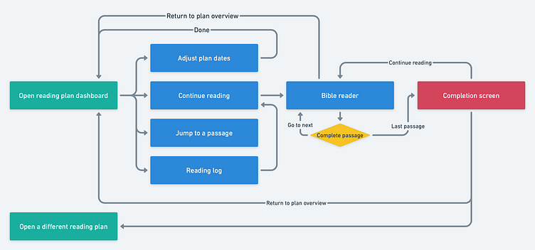
In addition to combining the best elements of the first suggested approach with the current flow, this approach includes three additional features that are either present in competing products or have been suggested through user research—the ability to select casual- or goal-based completion dates, the “jump to a passage” option, the “reading log” screen.
In the settings slide in panel, the user will be able to toggle between a “casual” mode and a “goal” mode. The casual mode will automatically adjust the completion date based on the user’s current progress and assuming one plan will be completed per day hereafter. This eliminates the pressure on the user if a few days are missed and encourages consistency. For users who wish to have a targeted completion date, the “goal” mode will allow them to set a target end date, eliminating the need for the “catch me up” feature currently available.
The reading log provides a record of when passages were complete as well as offering some statistics on completion rates, etc. that could encourage the user to maintain a higher level of engagement with the reading plan. (Goal 2)
The “jump to passage” feature allows users to take control of their reading plans to some degree by allowing them to jump ahead in the plan to read a particular passage without feeling like it was not being counted towards their overall progress. While this may seem to disrupt the flow of the plan, self-determinate options have proven to be effective in adult learning theory and could promote higher engagement. (Goal 3)
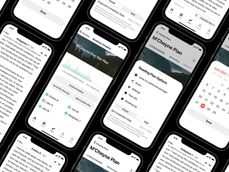
Visual Design Solution
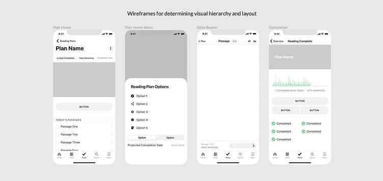
Wireframing in Figma
For the visual portion of the solution, I used the layout insight from the wireframes above to design the final prototype in Figma. After the prototype was built, animations were added to explore the solution from a motion design perspective.
Prototyping in Figma
For the visual portion of the solution, I used the layout insight from the wireframes above to design the final prototype in Figma. After the prototype was built, animations were added to explore the solution from a motion design perspective.
Thank you for viewing my case study.
This project and related case study was completed on my own and not affiliated with nor represents Life.Church or YouVersion.