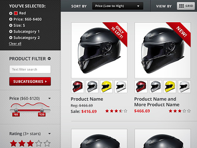
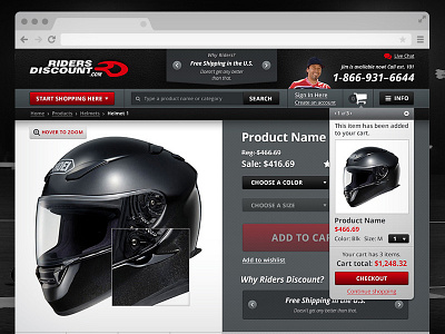
Riders Discount website - Product Page
Yet another shot of the Riders Discount website we did. This shows the product grid and filter categories to the left side of the page. We had to take into account all aspects of what people might be searching for and how to organize that information. We definitely looked into a lot of ecommerce sites to see how to do it best.
More by figmints View profile
Like

