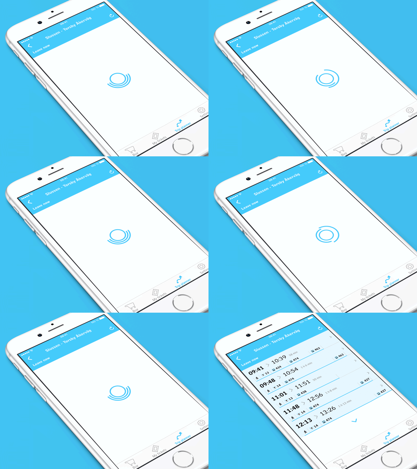
SL-tickets Search Results
The SL-tickets app is developed by Klarna for SL, and I'm fortunate enough to help Klarna with UX and UI design for the new trip planner functionality.
A custom spinner greets you before you are presented with your search results. An article by Facebook says custom spinners make you blame the app as opposed to the phone. But I think there's value in seeing something that doesn't immediately evoke the feeling of wait. A custom spinner can add an emotional value.
In the search results, each departure time is highlighted a bit extra. We iterated with a more advanced timeline view, which ended up in a simplified version at the bottom of each cell. The blue line represents the relative length of the journey, and you can see the different method of transportation along the way.
(This shot is showcased with a template by Ramotion)


