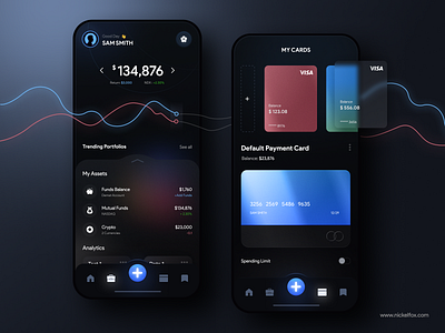
Trading & Payments App
Hello Dribbblers!
Here is my new design concept for all in one app which can help you to make your investment, manage cards & make payments.
Colors-
(Ultramarine Blue) #305BF3 - Primary colors for button & graph.
(Very Light Azure)#6FBAFC - Used lighter blue version for the combination.(Cinnamon Satin) #D06978 - Used as a color combination with ultramarine blue.(Black Coral) #4E5C75 - Used for unactive icons.
(Spanish Gray) #9C9C9C -Used for subtitle text
(Smoky Black) #0B0C10 - Used as a background color.
Font-
1. Product Sans (Regular & Bold)
Techniques
1. Glass Morphism
2. Iron Effect
Our Designer Says-
"Dark mode has been around longer than you might think. In fact, the world’s first computers used dark mode by default because screen illuminating technology wasn’t efficient enough to light up an entire screen without burning out."
Things you should consider while designing dark mode-
1. Avoid pure black
2. Avoid heavily saturated colors
3. Make sure there is enough contrast in your colors
4. Soften white backgrounds
5. Match your colors to your message
6. Communicate depth
Follow our dribbble page for such amazing designs.
---------------------------------------------------------------------------------------------------
---------------------------------------------------------------------------------------------------
Feel free to give me some feedback. And don't forget to press "L" if you love it.
Have an idea? Let's talk here or WhatsApp
Follow us here:


