ODS - Odama Design System 🔥
Hi peeps!
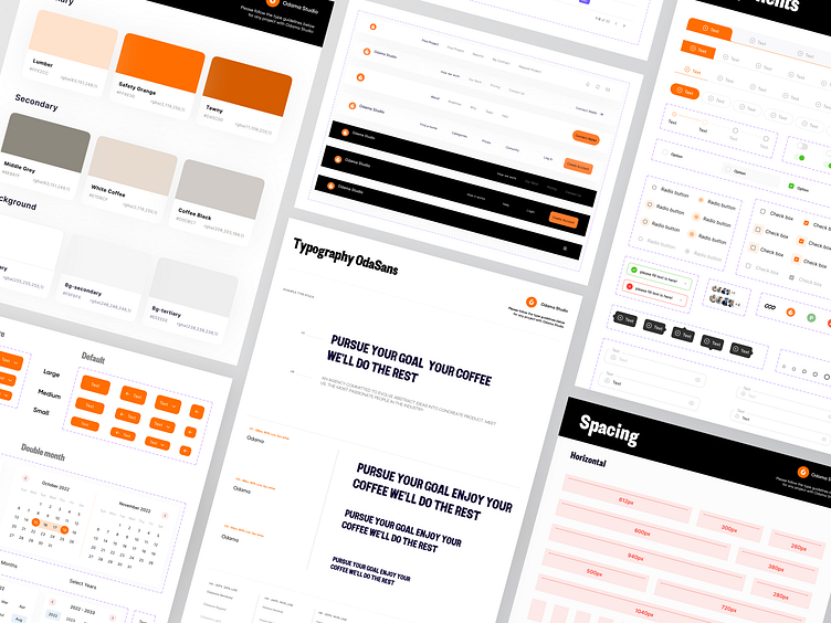
Recently, Odama Studio formed a special team to create a design system. The design system is the initial foundation with the official rules for creating a UI-KIT, Product, and project.
Allows you to make the initial UI design much easier and faster, the neatness of the UI design using the Design system is no doubt, so it is recommended to use the design system as the main reference or direction of the design that we will make.Here is a guide to the contents you will read.
Guide contents:
🆎 Typography - Placement, and Fonts
🌈 Colors - A Color palette that will be picked up by Odama.
🔧 Components - Customizing symbols.
Typography
The placement of our typography is adjusted to the types of screens commonly used, such as tablets, mobile, and websites. We made this size according to the official rules that are widely used.
Font
We created our own font which is called "Odasans". This font has a "Sans Serif" style. This font has four variants, which are light, medium, semibold, and bold.
Color
Here is a selection from the color palette selected by Odama Studio. We set it according to our primary color studio. Our color palette can be changed according to the color identification in the project we handle.
Component
A component library is a collection of things based on a UI set of rules. The Component library's purpose is to improve a project's consistency.The condiments in the Component library are buttons, icons, and layout styles.
Interest to partnering with us? Say hello at hellodama@odama.io or visit our website odama.io
Check us more at:
📷 Instagram | 🛒 Gumroad | 🎉 Figma Community


