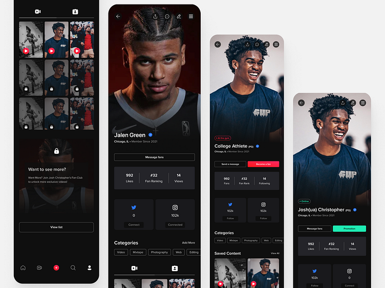
Crt Side - The Linkedin for Basketball Prospects. Case Study
Crt Side
I was the lead Product Designer at Crt Side, helping drive the design for the startup. The CEO's and business goals were to design a beautiful app and prototype MVP for them to secure some funding to hire a remote developer team and then build the MVP Product.
The company was able to secure its funding but shut down soon after.
My design process was a little different than how I would go about it at my full-time job. Since I was brought in as a freelancer and was the sole designer, I had a lot of freedom, but we also didn't have many resources.
I would have weekly meetings with the CEO and Marketing Director to discuss what they'd love to add as features. I would then take the week to design them out.
I noticed I was reusing parts over and over, so I took the initiative to build them out a small starter Design System and component library.
I would build these components using Figma's auto-layout feature to ensure that my designs were consistent.
After I would finish a few features, I would take the time to prototype then what we had so far and share that with the stakeholders and management team.
We did have a few athletes that would use the app when it launched and would test the prototypes, and we would run features by them as a small user research operation.
User Flow
We created user flows for each page before creating the product. Here's one of the earlier ones for potential user journeys.
Small Design System
I noticed during the design process I was using a lot of the same components throughout the product, so I made the decision to create a design system as I created new screens in case I had to reuse them more.
Figma Prototype
This prototype was created using only Figma and videos were made using GIFS.


