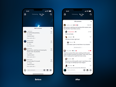
UI Enhancement 01 - TikTok comment page
I'm starting a new series focused on making minor improvements to everyday digital products. These shots highlight some of the UX problems I find, and how they can be enhanced!
Today I'm posting a re-design of the TikTok comment page. The current design makes it hard to see nested comments, uses the horizontal space poorly in the modal, and doesn't allow the modal to go full height. I've made several other improvements as well.
More by Boris Crowther View profile
Like
