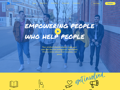
Reimagining Covenant House's Website
Helping a crucial non-profit reimagine its website for the busy, working professional and ultimately help homeless youth find housing in Chicago
---
PROBLEM
An out-of-date and bulky website lacks the attention-grabbing appeal needed to secure donations from the public.
As Covenant House Illinois (CHIL) planned to open up donations to the public they considered the user experience of their outdated website. It was clear that it lacked the visual appeal and functionality of other non-profit sites competing for the same funds. In addition, they planned to migrate their site from Squarespace to Wix.
SOLUTION
A clean, easy-to-navigate website that clearly informs users where donations go is key to appealing to busy donors who have lots of non-profits competing for their donations.
More by SYLVIA GONZALEZ View profile
Like
