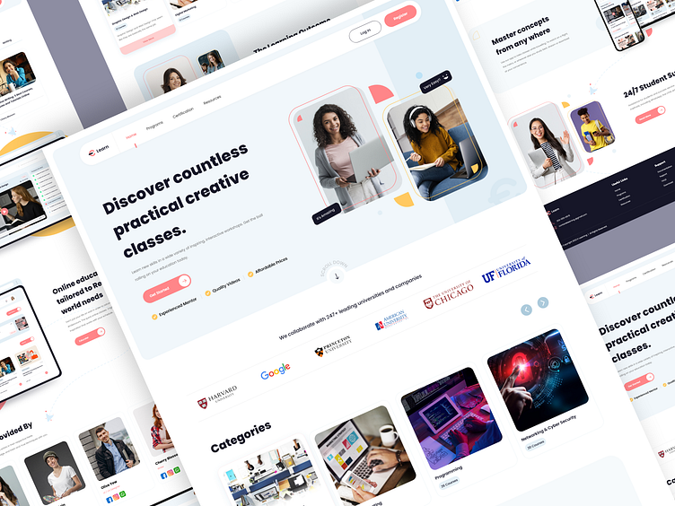
E-learning Website
E-learning designs that are responsive or interactive are becoming necessities. If you want to reach your learners, you must provide content for all of the devices they may use, including desktops, laptops, tablets, and smartphones. Additionally, you must provide an excellent (albeit perhaps not quite identical) experience on all platforms.
This e-learning website's user interface (UI) is organised into clear and straightforward steps, with supporting video demos and checklists. Through the use of convenient in-page links, students can quickly move between different parts of the page.
Learners are better able to grasp complex procedures when they are broken down into smaller, more manageable eLearning tasks. Here, we can see how incorporating examples within the structure encourages practice and helps students internalise the material, allowing them to catch up rapidly.
Do you have educational app ideas for e-learning? Are you looking for ways to enhance your e-learning designs? Reach out to us so we can assist you right away!
Let us know your thoughts in the comment below!
Press❤ "L" if you like it.
Co-create your ideas with us!👋 Drop a line at 📩 biz@cmarix.com or Visit Us - www.cmarix.com
Follow us for innovative designs: Instagram || Behance || Uplabs


