Dymacare rebrand - packaging redesign
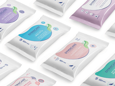
Previous Dymacare packaging had mixed styles and colours merging from years ago. A new packaging system was introduced where different categories (fragranced and fragrance-free bed bath, 2% chlorhexidine, flushable, incontinence care, antibacterial) were assigned different colours.A fun droplet became a distinctive packaging element. Dymacare is a medical brand that's known and often used in hospitals on terminally ill, bedridden, incapacitated patients. Deep inside, I wanted to make them smile or at least feel just a little better. Hospital packaging ofter can be rather cold and sad. Finding something that connected cleansing, water and smile was part of the process and the uplifting droplet shape felt just right. A brighter colour palette was introduced.
Instagram✨ https://www.instagram.com/ausracreates/
Behance✨ https://www.behance.net/ausravasileva
Have a project? Get in touch https://linktr.ee/ausracreates
