Chase.com
About
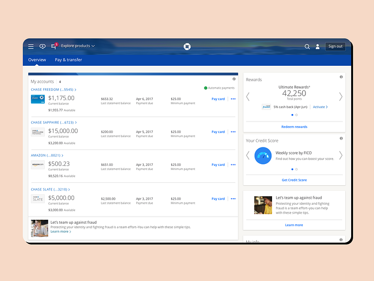
Chase was looking for a way to reimagine credit card payment done via their online portal at Chase.com. The goal was to turn a cumbersome, legacy payment process into a fast and easy payment flow, in-line with many of the contemporary UI standards. Existing credit card payment experience would take the user several pages deep without an intuitive way to get back, after the payment is made.
Our Solution
We immediately recognized that a slide-in panel design pattern would enable users to schedule and make credit card payments without leaving the account dashboard. This would allow users to have an overview of their account and make quick payments when needed. The result was Fast Pay - a UI that provided users with an easy-to-navigate flow with clear options to pay off statement balance, minimum payment, or full card balance, as well as schedule and view scheduled payments. Fast Pay was immediately adopted by customers and integrated into Chase.com, and remains the primary way for customers to make their credit card payments.
Services we provided
UX/UI design
Visual design
Mobile design
Hire designers used by the big guys.
We're happy to chat 👋: hello@nemomakes.com
Follow us on LinkedIn


