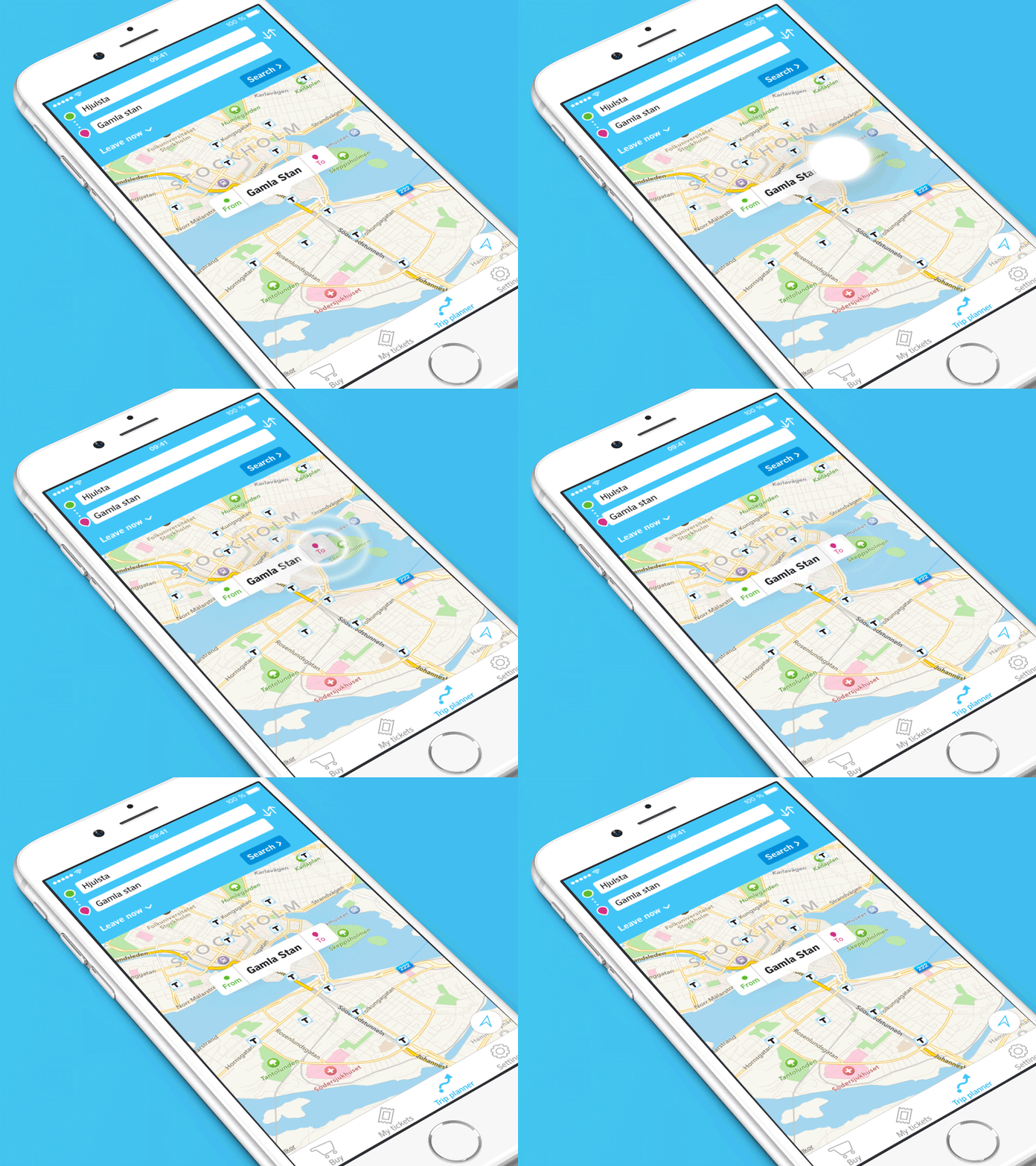
SL-tickets Trip Planner
The SL-tickets app is developed by Klarna for SL, and I'm fortunate enough to help Klarna with UX and UI design for the new trip planner functionality.
The visual style is based upon SL's brand guidelines and their campaign "Tillsammans Funkar Alltsammans", meaning roughly "together everything works".
The goal was to make the UI simple and inclusive so not to neglect any demographic which may not normally use apps. Therefore before being developed, the UI was made into a Flinto prototype which was tested on variety of travellers and we were able to get feedback from users early in the project.
The map shows Stockholm's metro stations. Tapping a station lets you put a start or endpoint from it. An animation clarifies what the button did.
(This shot is showcased with a template by Ramotion)


