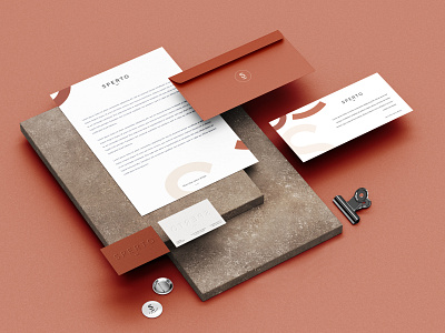
Branding for Sperto
Studio Sperto is a real example of how you can stand out with a simple and visually effective logo. A subtle smile and a tone of orange color are the key elements that tell the story of this spatial design studio. Creating an experience and a unique concept with a feeling of strength, calmness and connection.In the business world, little things are more important than you think. Small things also include business cards where you present yourself and what you do. For many, it's just a piece of paper, and very often a ticket to concluding new deals.
More by Marijana View profile
Like
