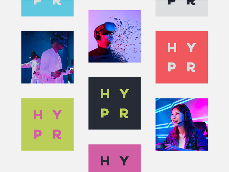
HYPR / Gamer Supplement Branding 🎮
Which logo do you find the most fitting🧐?
The logo of the energy supplement has to tell us about the energy boost⚡ from the first sight👁️. There are some ways to create an energy feel in the logo👨🏻🏫:
The bold font creates a confident and affirmative look❕.
Monospaced fonts create a more aesthetic and balanced feel🧘🏻♂️, which builds a convincing look for the viewers👀.
Vibrant and energising colours that evoke energy and enthusiasm by their vibes⚡.
'Share your energy with others and they will do the same' - the motto we should follow to create a beauty like this😎.
More by Marka Works Branding Agency View profile
Services by Mustafa Akülker
Like


