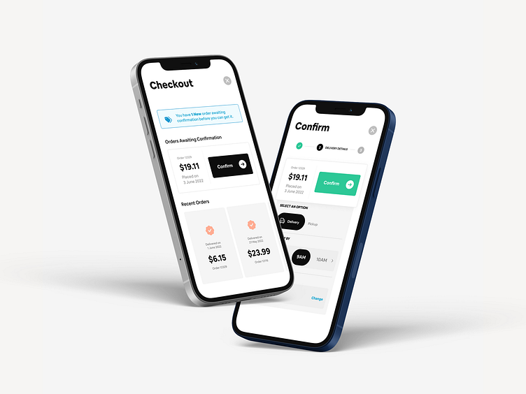
Checking Out Made Easy!
Challenge & Approach:
In the checkout part of online shopping, knowing what to do can be frustrating- especially when there is soooo much happening on the page or userflow and when the next step isn’t defined clearly!
When there is too much to read, too many action steps to take, and frankly, too much to consider; overwhelming a user's mental capacity would automatically attach a negative user experience to your app👎 And perhaps even avoid using it again - Unless they really have to.🥴
So we thought about this carefully - and knew we could create a different approach to a checkout flow.
Solution:
The thinking behind this was to:
- first and most importantly, not overwhelm the user!😵💫
- Secondly, improve the overall checking-out process.
- Thirdly, declutter the screen by removing any distractions and things that aren’t useful or necessary.🧹
- Finally, create one simply goal- IMPROVE CHECKOUT FLOW!
This would be in the form of a step-by-step reveal of detail and information - intentionally not displaying all options at once. This would allow the user to be absolutely focused on what task is at hand and check out with little to less distraction! 🧐
Business & User Value:
1. Business Value - Would likely increase the conversion rate and likely translate into repeat customers (assuming the product creates recurring value & offers a delightful user experience) 🔃
2. User Value - the flow would free up mental capacity and simplify the user experience. 😌
Let us know what you think of this project!
Contact us - if you have a similar project in mind or would like to improve one or more elements on your product - projects@redeemstudio.com 📧
#userexperiencedesign #userinterfacedesign #uxinspiration #uiuxdesign #uiinspiration #uxresearch #uxprocess #appdesigner #businessdesign #digitaldesigns #digitaldesigner #uishot #uishotoftheday #businessvalue #uservalue #designfeed #apps #uxui #appdesign


