Landing Page Design Process
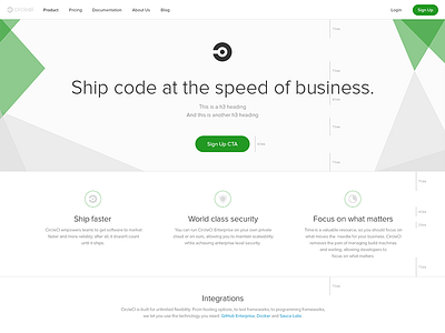
Brief look into our (evolving) design process for our outer marketing pages. For our enterprise landing page, we delivered mockups with design dimensions and how it aligns with our grid we just implemented. However, I don't consider mockups as ideal deliverables, code does play a part in our design process but (currently) at a later stage. Once something is pushed, we again review, make appropriate changes and iterate as necessary.
Today's change, we felt using centered text hurt readability so we left aligned paragraphs and reserved centered text for headers, which differs from the mockup.
The mockup's filename, enterprise-page-i.png, indicates we did (around) 9 iterations, which may be too many (or too few) something we hope to learn and improve upon going forward.
This is our first pass at moving towards our new uniform styling for our outer site. There's some issues with what we pushed today, to align it closer to the design, but those will be addressed in future PRs as we continue to iterate.


