Student Work: Ridgeline Product Page UI Design

Ridgeline Product Page UI Design Project: Codecademy x Figma Intro to UI/UX Course
In the summer of 2022, I decided to start delving into the world of User Interface/User Experience design. While my college touched upon the subject, I knew I needed more knowledge about this growing, dynamic sector of design. I decided to enroll in the 16-week Product Design course offered by Dribbble that would start in the fall, but I wanted to learn the basics of UI/UX before my first week of class. To get some starter information under my belt, I decided to take the short course called Introduction to UI and UX Design, which was offered by Codecademy in collaboration with Figma. After completing this course, I received a certificate of completion, which I then added to my Linkedin account.
This course by Codecademy and Figma delivered the basics of UI/UX design concepts, gave quizzes, and asked students to complete a design project. The project was to create a product page for a parka offered by a fictional outdoor clothing company called Ridgeline. General guidelines and suggestions for what to include in the design were written out to follow. Also included for student use were photos, icons, and copy for the product description information. I took it upon myself to create a simple brand logo to use for this site prototype.
Low-Fidelity Wireframe Sketches
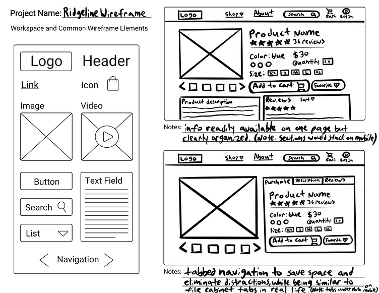
After reading the guideline information, the first step in the project was to do some rough, low-fidelity wireframe sketching. This was done to get a feel for which elements would exist on the page and where they would be placed in order to facilitate ease-of-use and be pleasing to end-users while facilitating the company’s ultimate goal: a sale of their product. Low-fidelity wireframing is done to get general ideas out on paper or a screen without being too specific or focusing too much on visual design, so that changes can easily be made and time is not wasted when crafting the high-fidelity, digital iterations in a software such as Figma, Sketch, or Adobe XD.
We were given a template in which to draw our designs; they were to be for a general desktop web browser. I downloaded the template and roughed out my ideas on my iPad Pro. My first wireframe sketch had more of a traditional layout, with text blocked out in their own sections and all viewable at once (with some scrolling). My second template incorporated a tabbed system to reduce distractions and hone in on what information a user would want to read. Both included a simple image slider. The use of icons was important to help reinforce ideas.
Working in Figma to Create a High-Fidelity Prototype
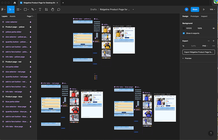
After my low-fidelity wireframes were complete, I decided to take what I thought were the best elements from them and combine them into a high-fidelity prototype. I started by blocking out my ideas in Figma and eventually turned those general elements into more polished pieces of the prototype. In the image above, you can see my three versions of the product page and the button, slider, and tab components for each. We were provided with the yellow parka photos for the product page and weren’t expected to have all colors viewable, but I edited them to make the red and blue photos for the other pages to make it feel as close as possible to a real product page.
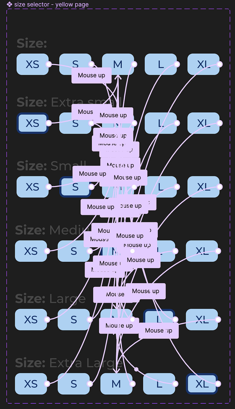
While the course mentioned using prototyping interactions to have the current screen change to a new version of the screen on click/tap to reflect buttons being pressed or state changes, I wanted to keep most of the interactions on one screen so that all previously-selected elements would not clear. To do this, I researched how to make image slider and button components and made it so that on click/tap, just the variant of the button set or slider would change instead of the entire page. You can see an example of connected interactions in the screenshot of the size selector buttons (note: I used “mouse up” instead of “on click” as the interaction type because on iPad screens, the buttons would not work correctly unless “mouse up” with a slight time delay was used).
While this course only asked for two interactive elements, I decided to make as many as I could in the body portion of the website interactive so that my intentions for the product were clear to anyone trying the prototype, and so that I could learn as much as I could software-wise to aide in my next course in the fall.
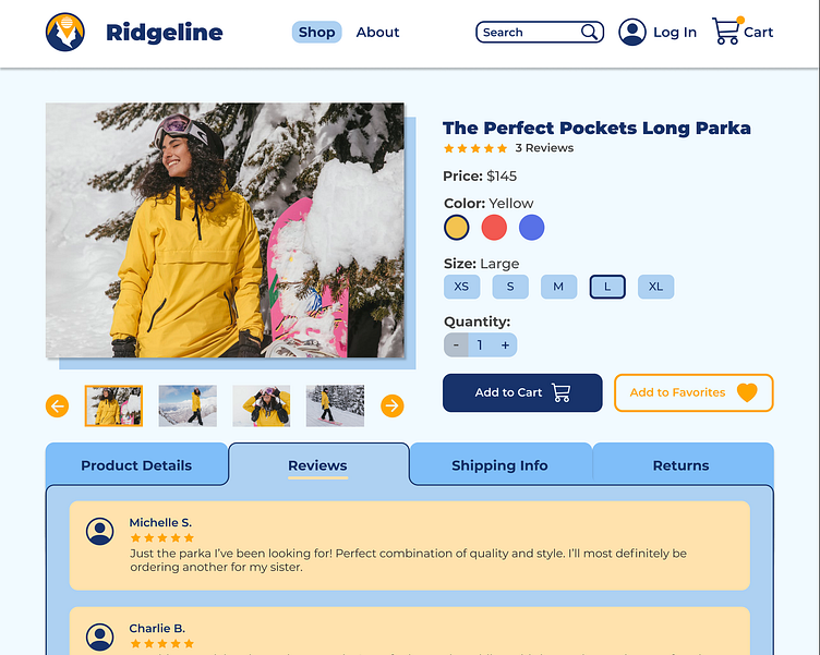
The Final Prototype
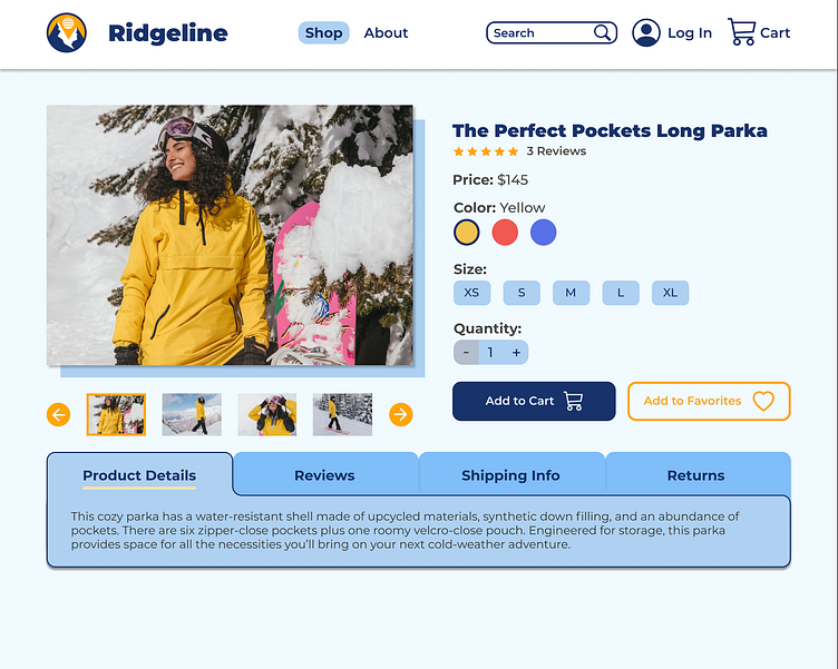

I decided to combine the top half of my first wireframe with the tabbed information system from my second to provide an easy-to-use and familiar page with the added functionality of being able to view and hide information at will with tabs, allowing the user to focus on just what they need. While the navy blue and white were admittedly influenced by some example screenshots I had seen advertised by Codecademy before taking the course, I decided to incorporate some more blues to connect to the feeling of being outdoors in the cold weather, which is what this particular product is intended for (and I assume many other offerings would be, too). I used the navy blue in the simple logo I constructed, as well, and also used orange to symbolize the sun; this same orange appears throughout the page in smaller elements to compliment the blue and provide a bit more visual energy.
Try the working prototype at: https://bit.ly/3rLANNa (best used in a desktop browser)
View the video of the working prototype here: https://bit.ly/3enH1jc
View my full creative portfolio here: https://breslindesign.com