University of Tiny Football

A few weeks ago while I was watching college football I contemplated what my Tiny Buffalo brand would look like if it were a University football team. The idea got stuck in my head. Doodles would draw my attention over the art boards, so I branded the University of Tiny Buffs football team...
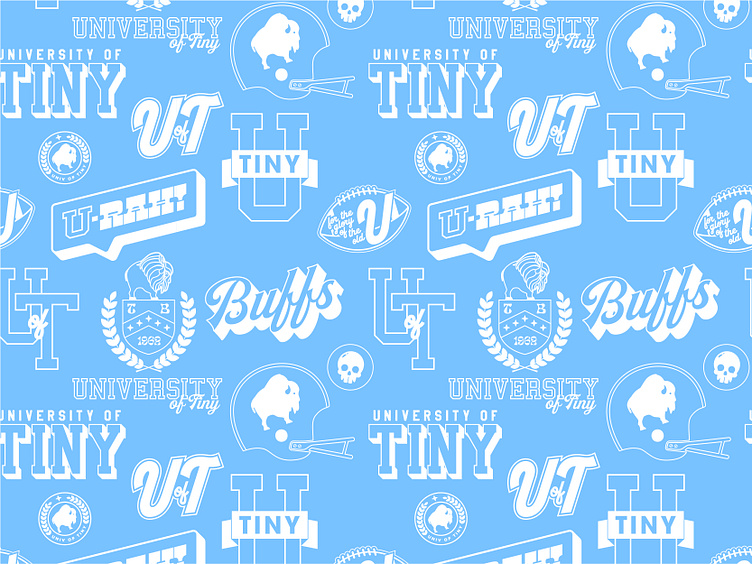
First thing I thought of was the name... University of Tiny
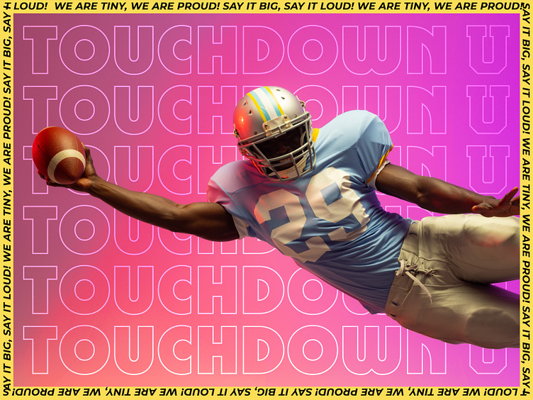
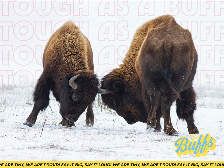
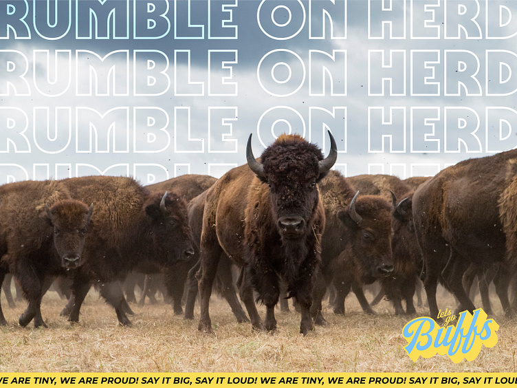
I chose University of Tiny over Tiny University because I liked U of T. I also liked the thought of there being a place called 'Tiny'. I was unsure on the colors but I knew it had to feature my familiar Tiny Buffalo brand bison as a main logo. I started with the pink, blue, and yellow color palette on a whim and used them as placeholders while I built the icons. When I went to find stock photos I was further emboldened in my choices after finding the perfect photo set that featured all the colors already in the palette.
Once I started idea bubbling on the name, the slogans and sayings came to me. It had to be 'small'-centric and proud to play off the word Tiny.
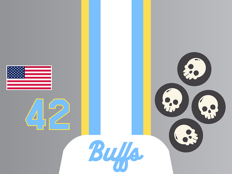
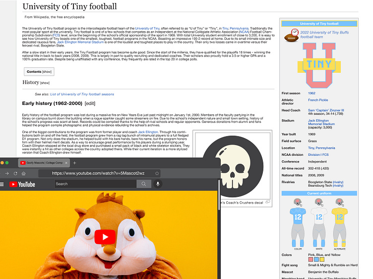
I incorporated the familiar Tiny Buffalo brand skulls into the mix as the award stickers on the back of the helmet. If you read the wikipedia page mock-up further down I gave them some lore.
I love taking inspiration from the past for the branding story; so I had to give the team a little bit of a visual backstory.
Working the elements together for the feel of the brand style.
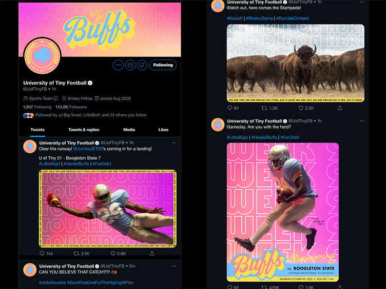
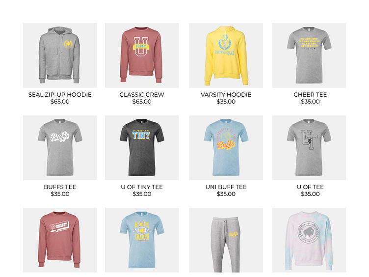
(twitter, wikipedia page, and school store mock-ups)
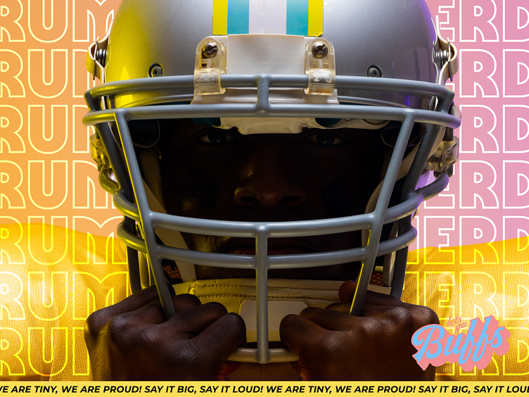
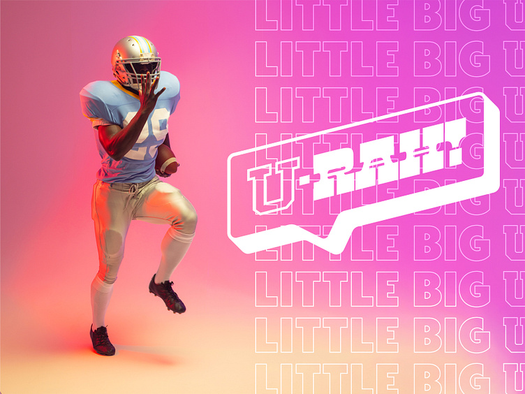
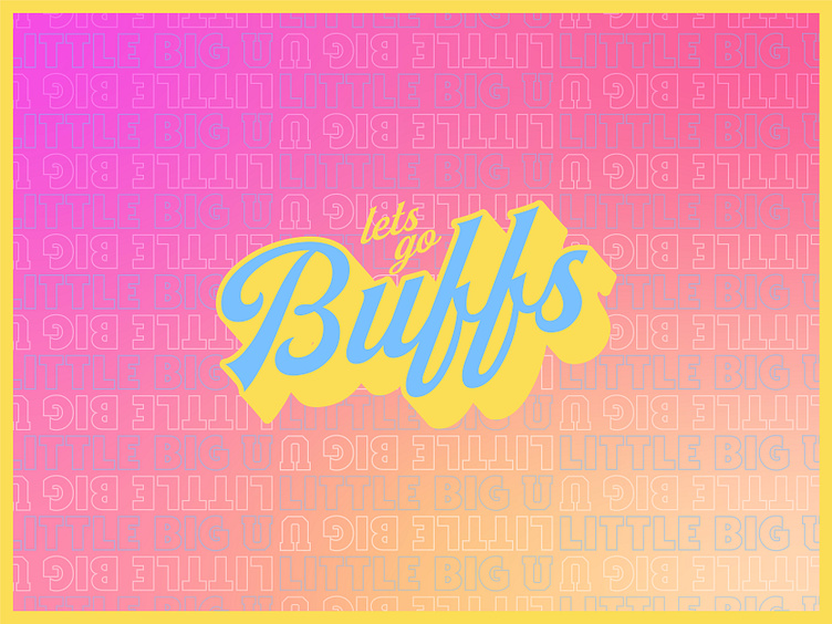
Media Template examples (would be resized for social and print)
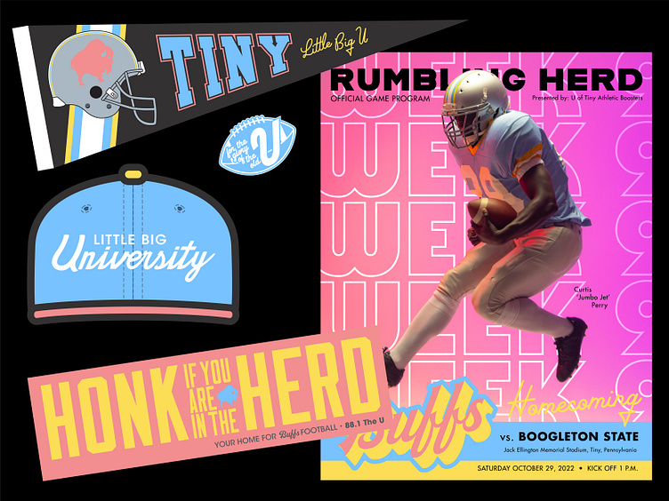
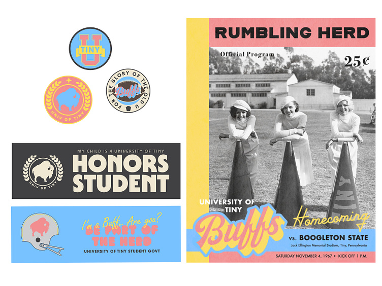
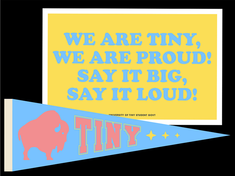
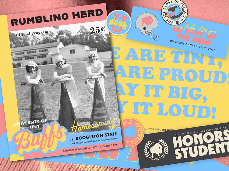
I loved getting deep for this project. I couldn't stop coming up with ideas formodern day and fauxback ephemera (game programs, bumper stickers, pennants, signs, buttons, etc...).
Like what you see?
Let's work together! Email me today at nrundio@gmail.com
