QEDON Brand Design

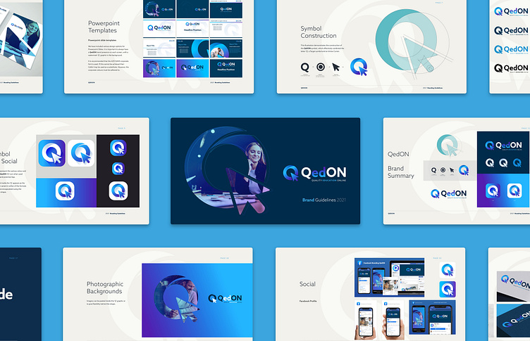
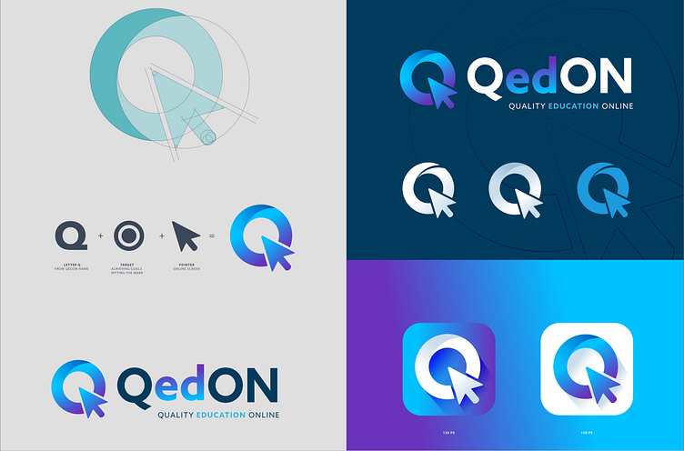
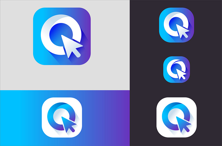
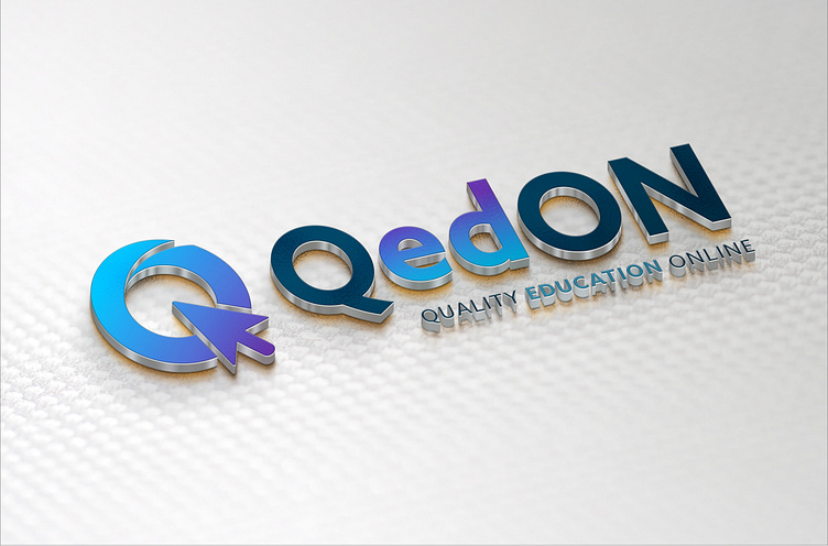
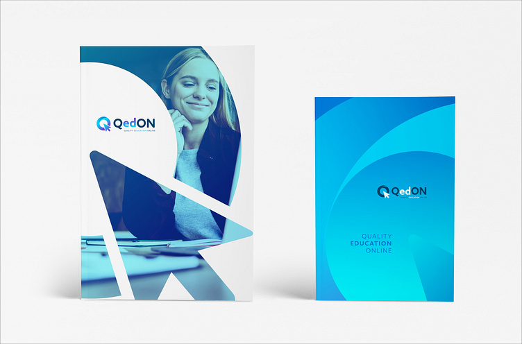
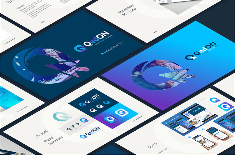
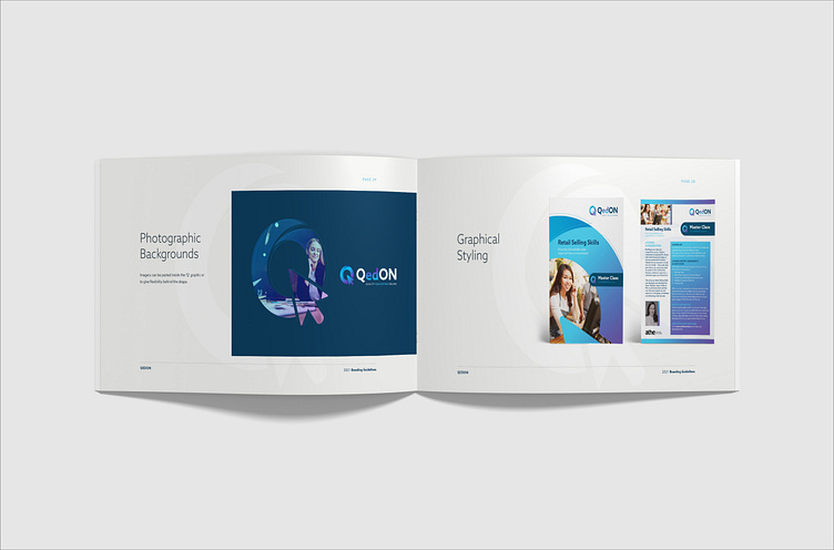
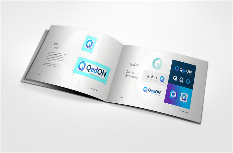
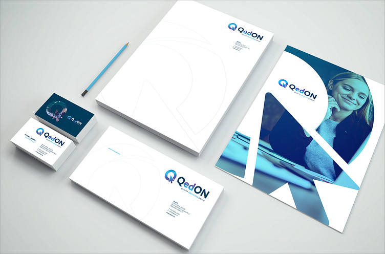
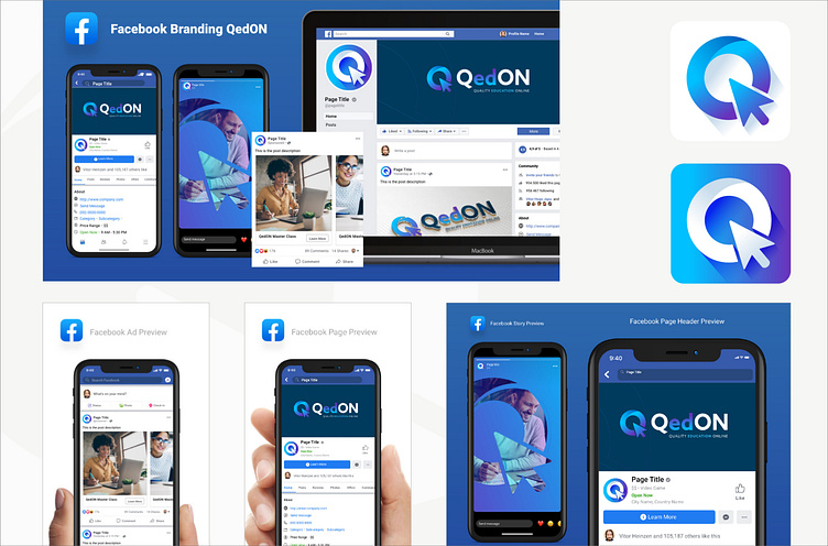
We were asked to design a brand for a new e-learning company called QedON, which specialises in international learning courses for Universities, businesses and direct customers. The brief was to create a borderless brand that would be applied across their website, e-learning resources and corporate assets. Our solution involved the creation of an icon representing the letter ‘Q’ which incorporated a little online arrow cursor. The letters ‘ed’ were colour coded to emphasise the wording ‘education’. Once approved we applied the design across a corporate identity guidelines manual, product specification sheets, Powerpoint, stationery and signage items.