LINTON ROBINSON Brand Design
We were commissioned under the Invest Northern Ireland Design Active Programme to create a new brand for Linton and Robinson Environmental Ltd.
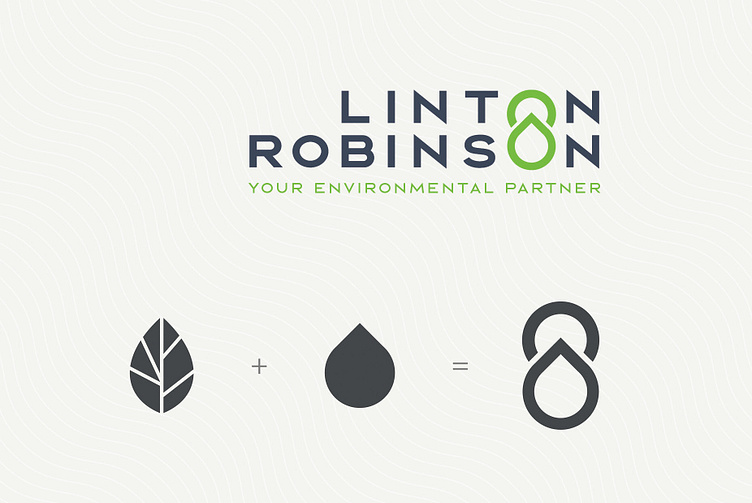
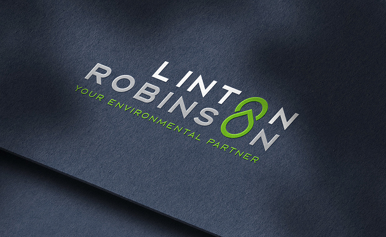
We stacked the words LINTON and ROBINSON aligning their letter ‘O’s. The Letters were then replaced with a combined leaf and droplet graphic, highlighting their key environmental side of the business and also their specialist agricultural waste liquid solutions.
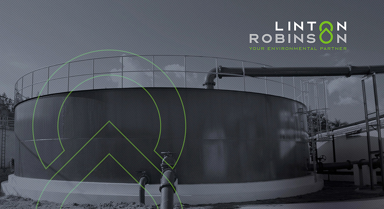
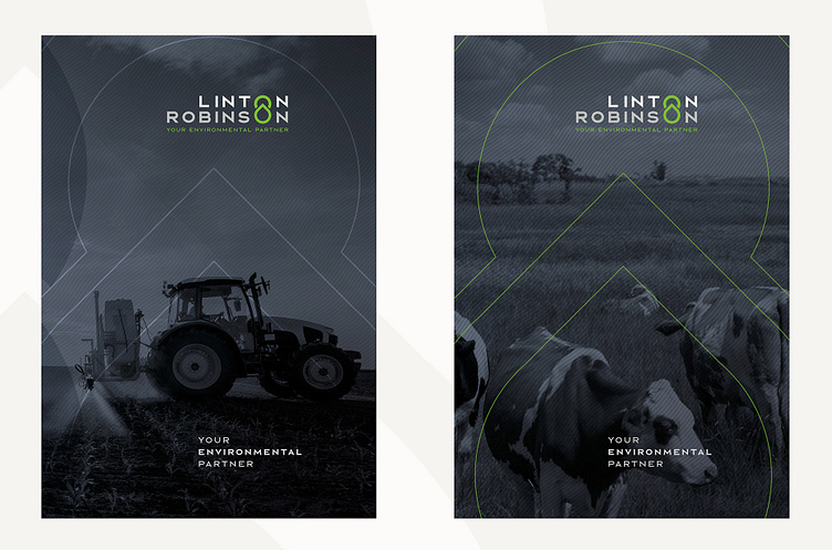
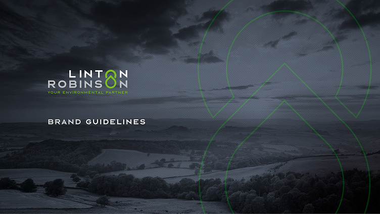
Graphically, we created a black and white style of background imagery using the new blue palette which we overlayed with a very fine wave pattern, representing agricultural ploughed fields. The end result is a very confident, mature and recognisable brand style, unique to the client.
Finally, we created a strapline “YOUR ENVIRONMENTAL PARTNER”. The projects Linton and Robinson Environmental Ltd have conducted over the decades are built upon expertise, trust, respect and reliability. It’s therefore accurate to refer to their customers as partners.
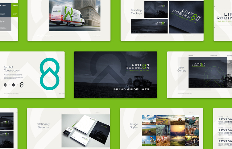
So, we created a digital brochure compatible across iOS and Android platforms, which can be viewed at the following link: https://online.flipbuilder.com/pahc/ghcd/