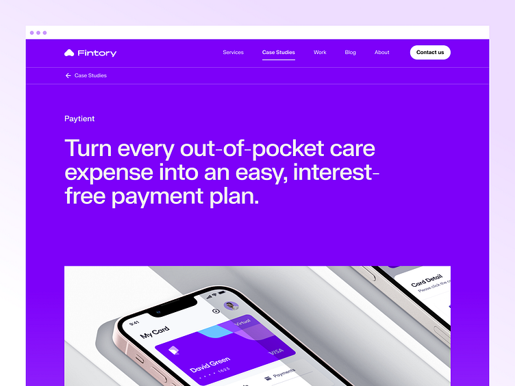
Paytient - Case Study
Hi all,
Paytient is an employer - or health plan - sponsored payment platform for medical expenses. Alongside any health plan, Paytient enables every member to access care in a financially healthy way. Paytient enables employees and health plan members to live better lives by helping them access and afford care in a way that is financially healthy.
View Project ↗
Our Mission
Paytient touches on two very sensitive topics: health and finances. Therefore, it was crucial to create an environment, in which the user feels safe and comfortable enough to engage with the services provided. On top of that, we had to make sure that the user understands and trusts the processes within the app - this required an intuitive and instructive UX, accompanied by a clear and aesthetically pleasing UI.
Beyond that, we were tasked to properly communicate their brand and values through a coherent design. With a color palette that, above all else, communicates clarity and trustworthiness, and a comprehensive, user-friendly design, we set out to build a platform that’ll make the user feel right at home.
The new mobile application
Paytient’s app is the company’s most important touchpoint, and it needed to do a better job of establishing the brand and communicating its values. That’s why we have analyzed customer needs thoroughly to come up with a design that builds trust and confidence fast.
Our redesign placed people at the heart of the experience in order to strengthen Paytient’s goal to be a human-centered payment platform for medical expenses that customers can trust and believe in.
____________________________________________________
🟢 Open for work.
I would love to hear about your idea.
📭 Reach out via mail: hey@kevdu.co
⚡️ Follow on Twitter for more detailed updates.
____________________________________________________


