FUTO logo rebrand
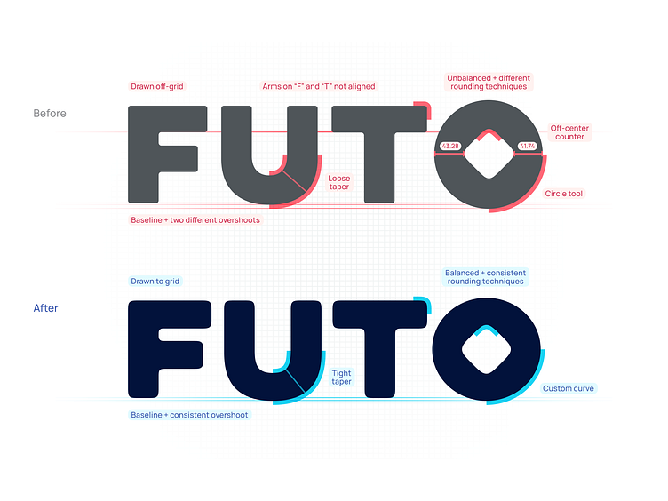
In rebranding FUTO, it was immediately clear the logotype was the key brand touchpoint and had to be handled rigorously. It had lots of technical problems to start with, but it nonetheless was a decent foundation.
Taking cues from the early logo, I got to drawing custom letterforms. One of the primary motifs is the new custom curves, especially on the “U” which give FUTO a more approachable sensibility and character.
I had a lot of fun bringing this to light.
More by Eli Schiff View profile
Like


