Designlab UX Academy Foundations | Fashion mobile app screens
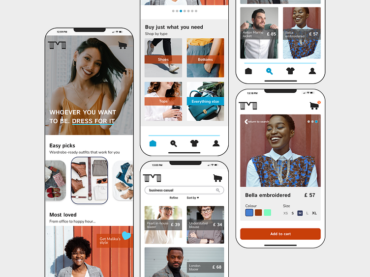
After putting the style tile together, I created 3 sample screens for the Modura app using visual and UI design principles. One of the things I decided to change was the logo, as it wasn't easily scalable. I chose my 2nd design for this exercise.
I began by selecting the 3 screens to work on:
1. Home screen showing latest offers on garments
2. Search results page
3. Screen showing details of an individual item of clothing
I proceeded to research on Dribbble and on competitor apps for ideas and noted some of the key UI elements that are commonly used in this kind of apps. I then sketched my designs on paper. When I was satisfied with the result, I created 3 frames on Figma. I first tacked the navigation elements, I searched for Pexels and Unsplash to curate images that suited the brand. Finally, I made sure that everything was aligned and that the colours used were accessible.
The Modura project so far:
⦁ Type
See my portfolio | Follow me on Instagram ⦁ Pinterest ⦁ LinkedIn
