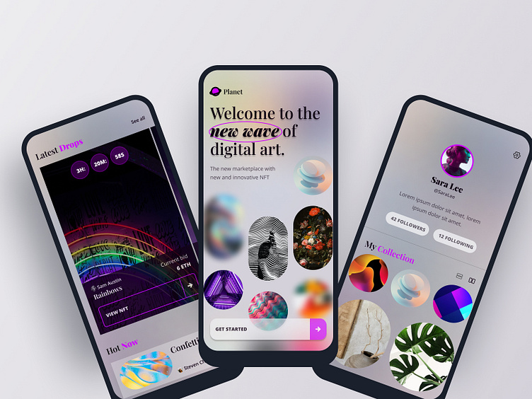
Planet: A NFT Marketplace Visual Design Concept
As a part of Dribble’s User Interface course, I worked on designing a NFT marketplace app for a fictitious company called Planet.
The Challenge
Planet’s goal is to revolutionize the NFT marketplace with a new mobile app that has a design-first approach and a deeply curated experience for it’s users who are tech saavy and have a strong visual aesthetic.
Final Prototype and Design
In a 4 week period, I was able to create a visual design, UI Library, and prototype in Figma that is ready to hand off to developers. This was an amazing project to work on and has given me an understanding of how to approach design projects, as well as, skills in Figma.
Read below for in-depth details on my role and thought process for this project:
My Role
As the UI Designer for the course, I’ve been asked to do the following:
Conduct research on existing apps and create a moodboard
Create and lock a visual aesthetic for the app
Develop a UI Library
Scale the design on multiple screens, based on the wireframes that were provided.
Create a functional high fidelity prototype that the client can use to get a realistic feel for the app.
Moodboard
I started the project off by researching existing NFT marketplace apps. I saved screenshots of apps that I liked and ended up creating two moodboards that each represent a different visual aesthetic. The first moodboard being “Dark and Sleek” and the second moodboard being “Dreamy and Futuristic”.
Dark and Sleek
Dreamy and Futuristic
Creating moodboards allowed me to better understand the design landscape for NFT marketplaces and also helped me discover my own style.
Visual Aesthetic
After creating the moodboards, I started doing some visual exploration by creating some splash screens. This part of the process was freeing as I tried out several ideas inspired by designs in my moodboard and tried to not restrict myself during this process.
Visual Exploration: Dark and Sleek
Visual Exploration: Dreamy and Futuristic
Locking it in
Ultimately, I decided to go with the Dreamy and Futuristic aesthetic. This aesthetic features a contrast of neutral colors with pops of color, visual interest with opacity, and contrasting font styles. In particular, I am inspired by the rounded rectangles and circles and other shapes I found when doing research on this aesthetic as it is interesting and unique. The aesthetic is dreamy, futuristic, and modern and fits in with Planet’s need for a “design-first” approach that appeals to artsy and techy users.
Scaling the Design and the UI Library
The client provided me with 5 wireframes:
Splash screen
Home screen
Profile screen
Search screen
NFT screen
After deciding on a design direction, I started working on designing and finalizing the design on all the screens. In conjunction, I developed my UI Library. This process has helped me become more familiar with figma and has helped me gain a deep appreciation for auto layout and using components because I was able to scale the design quickly and consistently with these key features.
UI Library
Typography
I used Playfair Display for the headings and Open Sans Font for the body, call to actions, and labels. I really like the contrast of using a serif font with a san serif font and feel like this particular combination is modern and works well with the aesthetic of the app.
Colors
I kept the color scheme simple — mostly neutral colors of black, white, and greys and then added a purple color as the pop of color. I feel like purple is often thought of as a futuristic color and felt that it would work well in the design.
Components
I used components throughout the design to stay organized and consistent. These components are the building blocks to my design.
Modules
I also created some modules such as various types of cards and image grids.
Final Design
Prototype
Conclusion
I’m quite pleased with my final design. Showing the design to users, a few immediately commented on how the design conveyed a dreamy and futuristic effect. One user commented on how they loved the use of interesting shapes.
“I really like how you showcased the artwork in different shapes, it makes the app standout and as an artistic soul, I find the app immediately more interesting.”
These user comments affirm that I met the challenge and was able to create a design that appeals to design and tech saavy individuals, while also being a design that fits in well with the existing NFT markespaces design landscape.
I’ve learned a lot from this project and really enjoyed working on this. A main takeaway for me in regards to the design process is to to approach a project with intention, thoughtfulness, and research and mix it in with your own creativity to create something unique and that will appeal to the client. Practical skills I gained was the importance of creating a UI library in order to make sure your design stays consistent, can be scaled across multiple screens efficiently, and stays organized.
I look forward to future design projects where I put the knowledge gained from this project to good use! :)


