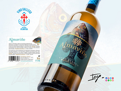
Almaviño label design
In this new design of the Almaviño label, the origin of this wine, which was harvested on the Atlantic coast of Galicia, has been taken into account, so we wanted to do something related, putting the point on the sea, the harvest and the unique weather of this region. To further enhance its connection with the sea, an illustration of a fish emerging from the water has been added, giving the bottle a greater freshness and visibility on any shelf, which contributes to better positioning and capturing the attention of potential customers. We know that appearance is crucial, as everything is judged by the eyes.
To achieve this effect, a completely new illustration has been created and a previous design that lacked vitality and did not convey a sense of quality to the product has been significantly improved. Thanks to this renovation, the label reflects the excellence and value of Almaviño wine more accurately.
