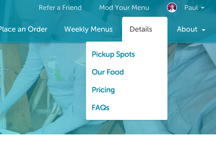
Primary Navigation
Primary navigation consists of two parts: the Customer menu (up top) and the Content menu.
Our previous navigation tried doing too many things at once. It was context aware, so it switched depending on the user, the state of their orders, the time of the day, which theory of quantum gravity was popular that day, and all sorts of willy-nilly ways. That confused our customers.
After much exploration, testing, and iteration, we settled on a split navigation aimed at our primary users: 1. new visitors checkin' us out (what do they do? do I like it? can I get it? do I like this people?) and 2. current customers with a subscription.
Along with intensive info architecture work to slim our content and map out our most common flows, we were finally able to bring the home page in-app (it previously lived as a landing page on a Wordpress instance.) This let us do the one context-aware switch we felt appropriate: take current, logged-in customers straight to their orders (vs taking them to the Welcome page.)
