King's Studio : Rebranding
King's studio it is one of my favourite clothing online stores. I had an epiphany and decided to give it a new look.
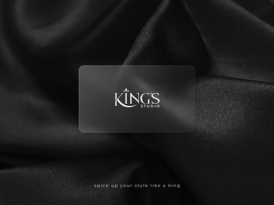
Following the trend of simplicity and minimalism, I chose a font that is more readable and has a royal appearance. A crown was also added to represent the company's quality and expertise in clothing. The signature dark shade of black, which represents power and elegance, has not changed..
It is not a formal rebranding, but rather an idea to improve the brand's style.
What is your verdict, 👍 or 👎?
Please share your thoughts.
