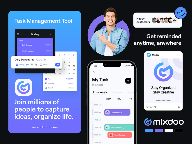
Mixdoo Brand Identity Design
Mixdoo, a task management app that helps users to stay organized, is recognizing educators and students.
The primary hues of purple and blue also have meanings associated with personality strengths and tend to be enthusiastic, sympathetic, and communicative. The shape represents a checkmark and the letter "M."
Available for Brand & UI/UX Design
Service and projects
📩 Let’s Chat: aiashik016@gmail.com
📞 Call me: Skype
More by Twinkle View profile
Like


