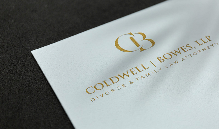
COLDWELL|BOWES - Rebranding
Coldwell|Bowes is a top family law firm based in Austin, Texas. They came to us for a new website, but they also said that they might be interested in updating their visual identity if we were able to convince them that we could give them something modern and bold that also preserved the spirit of their original branding. Challenge accepted.
The Original Branding
This was our starting point. It's not bad, but it didn't feel right for a family law firm to the stars. We thought they needed something classy but also a little intimidating - or as I described it to my team "a symbol on the wall in reception that when opposing counsel comes in for a deposition, they think to themselves, 'oh shit'."
Discovery & Pitch
We explored their competitive landscape to understand where the C|B brand fits in. Once we understood where we were, it was time to convince them that we knew where to go. These are slides from our pitch.
The Response
Ahead of our pitch, we were told by one partner that one of the founding partners was reluctant to change anything about the brand and that we shouldn't expect this to go well. So I was shocked when, after we pitched it to him, he decided that he loved it so much that he needed more people to hear our pitch. So, this founding partner calls me while I'm out grocery shopping (at that point, I knew him in name only) and asked me to pitch it all again. I said I'd be glad to. By the end of the day, we had locked in not just the logo but the color palette, typography, and image standards. I guess they were open to change afterall.
Colors, Typography & Web Design
While that founding partner was open to most changes, he wasn't willing to let go of what we called "CB Blue". It's a beautiful shade of blue that I like a lot, so we weren't going to push on that. Instead, we proposed color palettes that complimented CB Blue.
Up next was typography.
Then we put these all together to pitch the look & feel of their new website.


