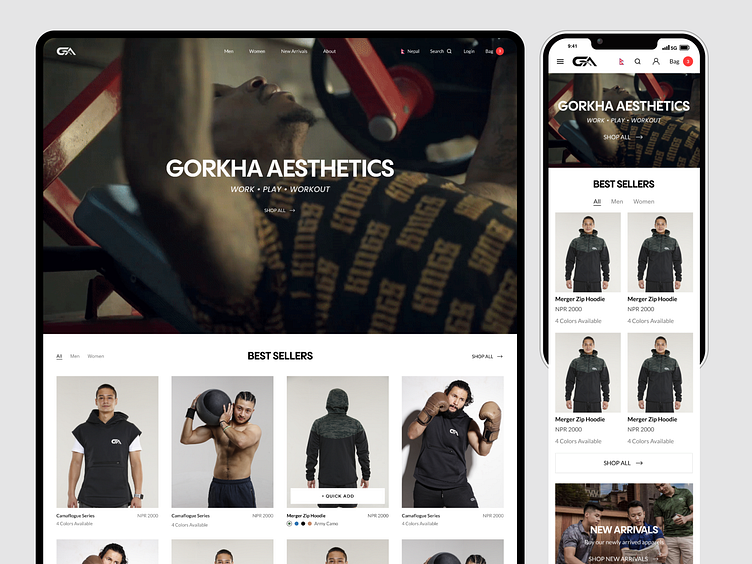
Gorkha Aesthetics - Web Design
About the Client
Gorkha Aesthetics is an athletic X lifestyle clothing brand in Nepal.
Find them on Instagram. Website under development, launching soon.
The Problem
They are currently handling customers from social media platforms and that often resulted in explaining the product details, available sizes, handling the payments manually and loss in time of both the customer and the business.
So, they wanted to have a website to showcase their products, and make it convenient for people to explore, filter the products and buy them.
The Goal
• To have an Online Showroom
• User-friendly, and a premium website experience
• Reduce manual customer interaction and improve buying (checkout) experience
Target Audience
17 - 45 yrs male in Nepal that are outgoing, sports enthusiast, athletes, fitness enthusiast, travellers etc. They also have customers from abroad and ships to few foreign countries: UK, Qatar, Malaysia, Denmark etc.
Style
Followed their monochrome brand color, used minimal design style with smooth animations to create a premium website experience.
A promo video at the top with the option to explore products, best seller products right below.
We also focused on New arrivals as they continue producing new products depending on different seasons, and Collection as they produce some limited edition collection from time to time.
People question the quality when said Made in Nepal so I decide to include the video of how it's produced (behind the scene).
Current video used in the hero section is taken from YouTube. Credit goes to the respective owner.
Initial Exploration
Initially I tried out a few layouts for hero section that would let people choose between men and women products but Gorkha Aesthetics products are currently focused on men products and they have a very few products for women.
They sponsor a lot of athletic events in Nepal and were on the process of making a promo video for the company so it was better to showcase that video in the hero section and have a single option to explore all the products.
Checkout
One of the major goal of creating the website was to create a smooth checkout experience that would result in improvement in the sales.
I went with quick add method where product card itself allowed to choose color and size to add to cart without going into the details page.
I used a slidebar that allows people to checkout without leaving the page they are on.
Mobile Responsive Design
Most of the customers message them on Instagram through their phones so having a mobile responsive website was a most have.


